Are you ready to embark on a captivating journey into the world of colors? As an experienced designer with a passion for all things aesthetically pleasing, I am thrilled to guide you through the mesmerizing allure of Turquoise. This enchanting hue has long fascinated artists, interior designers, and color enthusiasts alike, with its ability to evoke an incredible sense of calmness, balance, and sophistication. Through this article, we will unravel the timeless beauty of turquoise and explore its versatile applications in design. So, buckle up and prepare to be inspired by the captivating charm of this extraordinary color.
When it comes to design, one color that never fails to captivate is turquoise. Derived from a rare and valuable mineral, this stunning blue-to-green hue has held a special place in the world of gems and ornamental stones for centuries. Its name, meaning “Turkish,” pays homage to its origins, as turquoise first reached Europe through Turkey.
As a designer with a deep appreciation for colors, I have always been drawn to the allure of turquoise. The first recorded use of turquoise as a color name was in 1573, and since then, it has remained a timeless and captivating choice for creating visually stunning spaces.
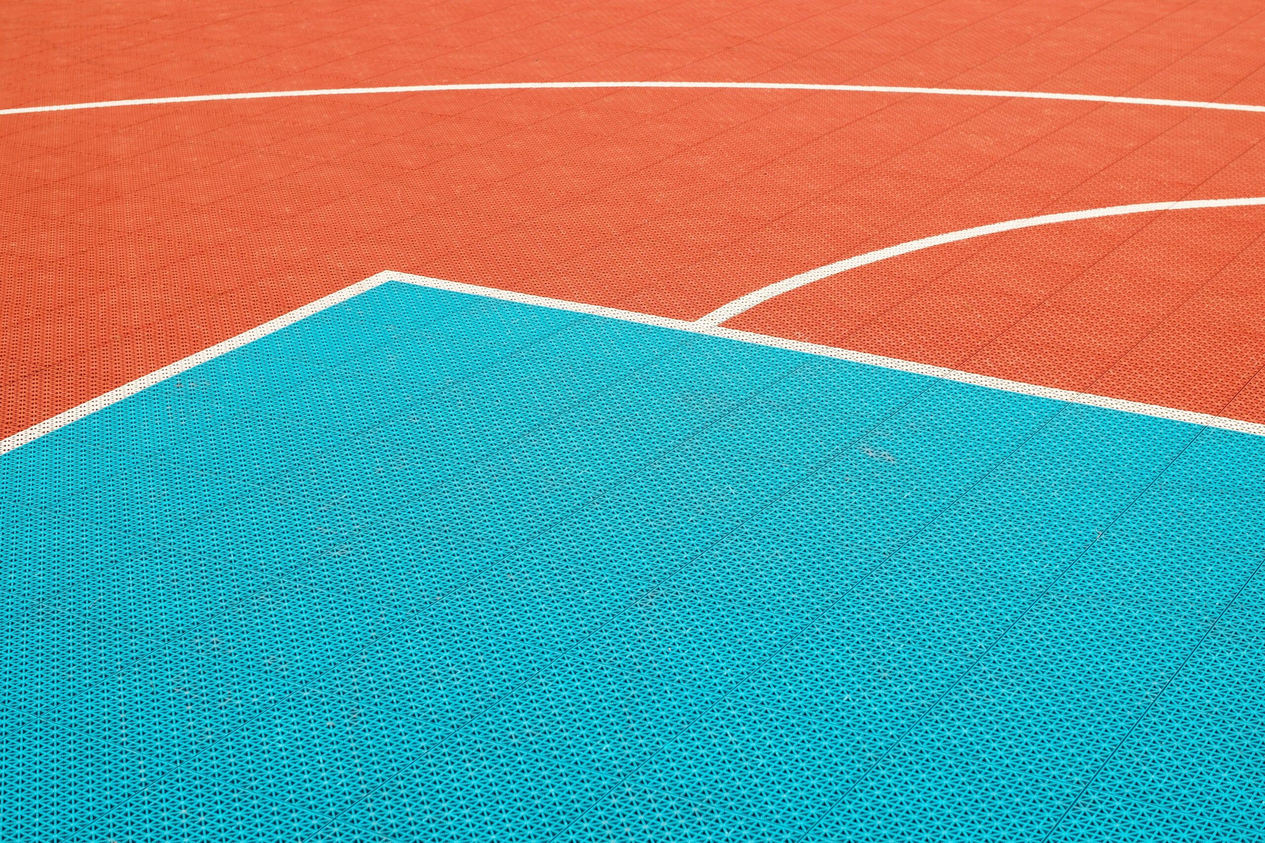
Turquoise has the power to evoke a sense of calmness, balance, and sophistication in any setting. It has a unique ability to transport us to serene coastal landscapes or vibrant tropical paradises. Just picturing the tranquil waters of a turquoise lagoon can instantly create a sense of relaxation and tranquility.
In the world of design, turquoise is a versatile color that can be incorporated in various ways. From accent walls and furniture pieces to decorative accessories and artwork, there are countless opportunities to infuse this captivating hue into a space. Its refreshing and invigorating presence can breathe life into any room, turning it into a visual masterpiece.
When working with turquoise, it’s essential to consider the quality factors of this remarkable color. It is judged based on its hue, texture, and the presence or absence of matrix. The most prized turquoise color is an even, intense, medium blue.
As a designer, I have discovered numerous ways to use turquoise effectively. Its calming effect can be harnessed to create serene bedrooms or elegant living spaces. Pair it with warm neutrals, such as sandy beiges or creamy whites, to create a harmonious balance. Blend it with pops of vibrant coral or golden yellows for a tropical-inspired vibe. The possibilities are endless.
In the world of design, turquoise holds an immutable charm that transcends trends. It is a color that stands the test of time, effortlessly infusing spaces with a sense of sophistication and vitality. So, the next time you’re looking to add a touch of allure to your design project, consider the mesmerizing beauty of turquoise. As the saying goes, “A touch of turquoise can transform the ordinary into the extraordinary.”
Remember, the world of color is vast and enchanting, and turquoise offers a gateway to timeless beauty. So why not explore its captivating allure for yourself?
Turquoise is a captivating gemstone that has captivated humans for centuries. Its vibrant blue-green hue is like a glimpse of the ocean on a sunny day. If you are curious to learn more about this fascinating gemstone, we have gathered a list of interesting facts about turquoise. From its origins to its metaphysical properties, these facts will not only amaze you but also deepen your appreciation for this exquisite gem. So, why wait? Click here to uncover the enchanting world of turquoise: interesting facts about turquoise
Turquoise is a captivating color that carries a profound meaning. Its vibrant hue symbolizes tranquility, wisdom, and abundance, making it a popular choice for jewelry and home decor. But did you know that the symbolism of turquoise goes beyond mere aesthetics? Discover the fascinating meaning behind turquoise color by diving into the realm of symbolism. Uncover the hidden messages and cultural significance associated with this mesmerizing shade. Click here to explore more about the turquoise color symbolism and unravel its mystical secrets: Turquoise color symbolism.
In addition to its symbolism, the psychology behind turquoise color is equally intriguing. This unique shade has been known to evoke feelings of emotional balance, clarity, and self-expression. Immerse yourself in the world of turquoise and understand how it affects our emotions and behaviors. Uncover the psychological impact of this enchanting color and how it can positively influence your life. Click here to delve into the psychology behind turquoise color: Turquoise color psychology.
When it comes to turquoise, there is no shortage of meanings and symbolism. Its timeless beauty and versatility have made it a popular choice across various cultures and artistic domains. Explore the depths of turquoise color meaning and discover its significance in different aspects of life. From ancient traditions to modern interpretations, turquoise holds a special place in the hearts of many. Click here to unravel the intriguing turquoise color meaning: Turquoise color meaning.
Turquoise color encompasses more than just a visually stunning shade; it carries profound symbolism and psychological impact. Embark on a journey of exploration and enlightenment as you discover the fascinating world behind this captivating color. Whether you’re drawn to its symbolism, psychology, or cultural significance, turquoise color offers an array of intriguing possibilities. Immerse yourself in the allure of turquoise and let its mystical charm captivate your senses. Start your journey today and click here to delve deeper into the wonders of the turquoise color: Turquoise Color.
Mixing Turquoise: A Guide to Color Theory
[youtube v=”dAvvHiDV0KU”]
If you’ve ever tried to mix the color turquoise but ended up with shades of grayish blues and greens instead of the vibrant teal or turquoise you were aiming for, don’t worry – you’re not alone. In this article, we’ll explore the process of mixing turquoise and uncover some valuable insights to help you achieve the color you desire.
The Challenge of Mixing Turquoise
Mixing colors can be trickier than it seems, especially when you’re aiming for a specific shade like turquoise. Many people mistakenly assume that adding white to ultramarine blue and yellow will create the desired turquoise hue. However, this often results in a color that is too green and falls short of capturing the true essence of turquoise.
Understanding the Color Wheel
To understand why it’s challenging to achieve the perfect turquoise by mixing primary colors, let’s take a look at the color wheel. Turquoise lies between the purplish blues and yellows, but the distance between these colors on the wheel is significant. When we try to transition from the purplish blues to yellow and then to white, the resulting mixture tends to fluctuate between grayish greens and blues, lacking the vibrancy of turquoise.
The Importance of Pigment
So, how can you achieve that intense turquoise color you desire? The key is using the right pigments. While it’s possible to create various shades of blue and green by mixing different combinations of colors, getting the exact intensity of turquoise often requires purchasing a dedicated turquoise pigment.
Embracing Turquoise in Design
Turquoise is a stunning hue that has been used in design for centuries. Its combination of blue and green evokes a sense of calmness, balance, and sophistication. Incorporating turquoise into your space can be done through accent walls, furniture pieces, and decorative accessories. For a harmonious balance, pair turquoise with warm neutrals, or create a tropical-inspired vibe by combining it with vibrant coral or golden yellows.
Timeless Beauty
Turquoise is a timeless color that brings sophistication and vitality to any space. Its unique character adds a touch of elegance and charm, making it a gateway to timeless beauty in the world of design.
In conclusion, mixing the perfect turquoise color can be challenging, but understanding the color wheel, embracing the right pigments, and exploring its versatility in design can help you achieve the desired result. By incorporating turquoise into your space, you invite a sense of calmness, balance, and sophistication, while also infusing a timeless beauty that will stand the test of time.
“Achieving the perfect turquoise hue may require a dedicated turquoise pigment, but the results are worth it – a vibrant and sophisticated color that adds vitality to any space.”
FAQ
What is turquoise?
Turquoise is an opaque, blue-to-green mineral that is a hydrous phosphate of copper and aluminum. It is also a color based on the mineral of the same name.
Why is turquoise considered valuable?
Turquoise is rare and valuable, prized as a gem and ornamental stone for thousands of years. Its mesmerizing allure and beautiful hue contribute to its value.
Where does the name “turquoise” come from?
The word turquoise comes from the French word turquois, meaning ‘Turkish’, because the mineral was first brought to Europe through Turkey.
What are the qualities that make turquoise desirable?
Turquoise is judged on three basic quality factors: color, texture, and the presence or absence of matrix. The most prized turquoise color is an even, intense, medium blue.
Does turquoise have any therapeutic effects?
According to people who practice medicine, turquoise has a calming effect on patients. Its calming properties add to its appeal in design and aesthetics.
Hello, My love for writing is rivaled only by my passion for in-depth research. While many may skim the surface, I dive deep, seeking the hidden gems of information that give a story texture and depth. Every word I write is backed by hours of exploration, ensuring that my work is not just compelling, but also meticulously accurate. Join me on a journey where every piece is a deep dive into the realms of knowledge and storytelling.