Dive into the captivating history of the Vancouver Canucks jerseys, a colorful journey through the team’s visual identity. From the iconic blue and green hues to the evolution of their logos, this article explores the stories behind the Canucks’ uniforms, showcasing how they have shaped the team’s legacy and captivated fans for generations.
The evolution of the Vancouver Canucks’ jerseys reflects the team’s journey through different eras, colors, and design elements. Each iteration embodies a distinct period in the Canucks’ history, showcasing their growth and connection to Vancouver.
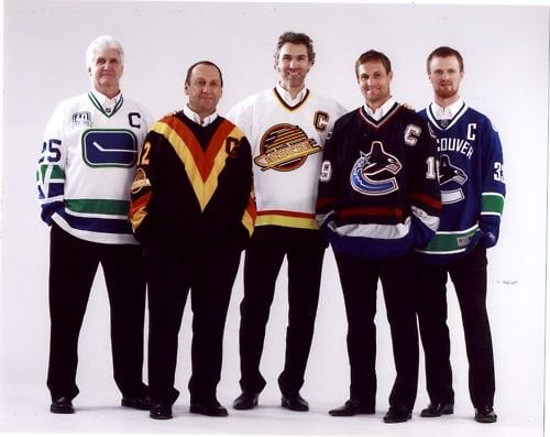
Back in the Day: The “Flying Skate” Era (1980s)
The 1980s saw the Canucks sporting a fresh, clean look with blue and green jerseys, drawing inspiration from the beauty of the Pacific Northwest. The defining feature of this era was the “Flying Skate” logo, a symbol instantly recognizable to hockey fans. This logo remained a staple until 1997, representing an era defined by its bold simplicity.
The Big Change: The “Orca” Era (1990s-Present)
In 1997, the Canucks underwent a significant visual rebranding, introducing the “Orca” logo, an emblem that has since become synonymous with the team. This powerful image of an orca whale crashing through the ice perfectly captures the team’s strength and speed. The “Orca” logo resonated with fans, quickly becoming a symbol of Vancouver’s hockey pride.
Home Ice Advantage: Blue and Green Dominance
The Canucks’ home jerseys are a tribute to their roots, predominantly featuring the iconic blue and green color scheme. These jerseys often showcase the “Orca” logo and incorporate subtle design details that pay homage to the Canucks’ past. It’s a classic look that embodies tradition and a connection to their Pacific Northwest home.
On the Road: Experimentation and Variety
Away games have provided the Canucks with an opportunity to experiment with bolder colors and patterns. From black and gold to silver, these jerseys showcase the Canucks’ evolving style and allow them to make a statement on the road. This experimentation demonstrates the team’s willingness to embrace new ideas while maintaining their core identity.
Beyond the Game: Special Edition Jerseys
The Canucks have released special edition jerseys to commemorate significant milestones, anniversaries, and cultural events. These unique designs often feature bold colors and meaningful symbols that pay tribute to the team’s history and their deep connection to the Vancouver community. These jerseys go beyond the realm of sports, reflecting the Canucks’ role as community ambassadors.
What were the old colors of the Vancouver Canucks?
Before settling on their current blue and green scheme, the Vancouver Canucks experimented with a rather bold color combination: black, yellow, and red. This unique and eye-catching look defined the team’s visual identity throughout the 1980s and early 1990s.
The Canucks’ very first jersey, worn from 1970 to 1978, featured blue and green, representing the Pacific Ocean and the natural beauty of Vancouver. However, towards the late 1970s, the team began experimenting with a black jersey featuring a yellow and red skate logo, hinting at a potential shift in their visual identity.
By the 1980s, black, yellow, and red became the Canucks’ primary colors, a departure from their original scheme. This bold move brought a fresh and daring aesthetic to the team’s uniforms. However, in the late 1990s, the Canucks decided to return to their roots, embracing the blue and green that had become synonymous with their team and city.
What is the symbol on the Vancouver Canucks jersey?
The Vancouver Canucks jersey prominently displays the iconic “Orca” logo, a symbol deeply intertwined with the team’s identity and their connection to the Pacific Northwest. Introduced in 1997, the logo features an orca whale, a creature synonymous with the region, breaching through an ice floe.
The choice of an orca was deliberate, as these majestic creatures are frequently spotted in the coastal waters of British Columbia. The orca embodies the power, grace, and untamed beauty of the Pacific Northwest. By adopting the orca as their emblem, the Canucks aligned themselves with the spirit of their home, reflecting its natural splendor and indomitable spirit.
The “Orca” logo represents more than just the team’s geographic location; it embodies their playing style and tenacity on the ice. The orca’s relentless nature mirrors the Canucks’ determination, making it a fitting symbol for the team’s pursuit of victory.
While the “Orca” logo is the most recent major design, the Canucks have experimented with various logos throughout their history. Exploring these past iterations offers a fascinating glimpse into the evolution of the team’s identity and how they have chosen to represent themselves visually over time.
What is the most popular Canucks jersey?
Determining the most popular Canucks jersey is akin to choosing a favorite memory; each holds a special place in the hearts of fans. However, the “Flying Skate” jersey, worn from 1985 to 1997, consistently ranks high among fans, symbolizing an era defined by its classic design and the team’s on-ice success.
The original Canucks jersey from 1970, with its simple yet elegant design, also holds a special place in the hearts of many fans. It represents the team’s inception and evokes nostalgia for the early years of the franchise.
The “Latest Orca” jersey, introduced in 2023, presents a modern take on the team’s iconic logo. With its streamlined design and bold use of the orca, it has the potential to become a future classic.
Another fan-favorite is the “West Coast Express Away” jersey worn from 1999 to 2002. This jersey, with its black base and striking white and yellow stripes, represents an era of explosive offensive prowess, led by players like Pavel Bure and Markus Naslund.
The beauty of hockey jerseys lies in their ability to transcend the realm of sportswear and become cherished artifacts. Each jersey represents a chapter in the team’s history, and every fan has their own personal favorite, imbued with memories and emotions.
What is the oldest Canucks jersey?
While pinpointing the absolute oldest Canucks jersey proves challenging, the team does possess a red and blue canvas jacket dating back to their inaugural 1945-46 season. This remarkable piece of memorabilia offers a glimpse into the team’s early years and the evolution of hockey apparel.
The oldest known Canucks jersey belonged to player Bill Chalmers and is estimated to be from the 1954-55 season. This jersey, a testament to the team’s history, is currently on display at the BC Sports Hall of Fame.
The scarcity of older Canucks jerseys can be attributed to the unique practices of former equipment manager Eddie Shamlock. Shamlock insisted on collecting jerseys after every game for reuse, a pragmatic approach that, while budget-conscious, has made it difficult to trace the lineage of early Canucks jerseys.
During their 100th-anniversary celebration in 2013, the Canucks paid homage to their roots by wearing Vancouver Millionaires replica jerseys, a gesture that highlighted the team’s rich history and connection to the city’s hockey legacy.
The possibility of even older Canucks jerseys lurking in attics or private collections adds an air of mystery and excitement to the hunt for these historical artifacts.
Why do the Canucks have two jerseys?
Unlike most NHL teams that have distinct home and away jerseys, the Vancouver Canucks alternate between two primary jerseys, a tradition rooted in their history and their connection to their home city.
When the Canucks joined the NHL in 1970, they chose blue and green as their team colors, reflecting the natural beauty of British Columbia. These colors, representing the lush forests and sparkling ocean of the Pacific Northwest, became integral to the team’s identity.
In the late 1990s, the Canucks introduced a sleek black away jersey to complement their new “Orca” logo. This modern design resonated with fans, becoming a symbol of the team’s evolving style and on-ice intensity.
The Canucks’ decision to maintain two primary jerseys allows them to showcase different facets of their identity. The blue and green jerseys represent tradition, paying homage to their roots in the Pacific Northwest, while the black jersey reflects their modern, fierce approach to the game.
By keeping both jerseys in rotation, the Canucks bridge their past and present, creating a visual reminder of their journey and their enduring connection to Vancouver and British Columbia.
When did the Canucks change to blue and green?
The Vancouver Canucks first donned the now-iconic blue and green color scheme in 1970, upon their entry into the NHL. These colors were carefully chosen to reflect the natural beauty of the Pacific Northwest, with blue symbolizing the vast Pacific Ocean and green representing the lush forests that define the region.
In 1997, the Canucks experimented with a new color palette, opting for a combination of blue, red, and silver. This era also saw the introduction of the “Orca” logo, a design that would become synonymous with the team.
However, the allure of their original colors proved too strong to resist. In 2007, the Canucks returned to their roots, embracing the blue and green that had become deeply ingrained in their identity. This return to their original colors signified a renewed commitment to their heritage and a recognition of the deep connection between the team and its home.
What are the Vancouver Canucks Colour Codes?
The Vancouver Canucks’ color palette is a carefully curated blend of hues that represent the team’s identity and their connection to the natural beauty of Vancouver and British Columbia. These color codes ensure consistency across all team branding, from jerseys and merchandise to logos and promotional materials.
Blue (#00205B): Often referred to as “Canucks Blue” or “Pacific Blue,” this deep, rich blue evokes the vast expanse of the Pacific Ocean, a defining feature of the Pacific Northwest landscape.
Green (#00843D): Known as “Canucks Green,” this vibrant, almost-emerald shade captures the lush forests that blanket British Columbia, representing the region’s wild beauty and untamed spirit.
Dark Blue (#041C2C): Sometimes called “Canucks Navy,” this sophisticated shade adds depth and complexity to the palette. It’s reminiscent of the shadowy depths of a forest or the mysterious waters beneath a starry sky.
Gray (#99999A): Referred to as “Canucks Silver” or “Gunmetal,” this neutral gray provides a clean and balanced backdrop, allowing the vibrancy of the blue and green to stand out.
White (#FFFFFF): Crisp and classic, white provides a stark contrast, ensuring that the Canucks logos and emblems pop against the background.
The Canucks’ color codes are more than just a random selection of hues; they are a visual love letter to British Columbia, embodying the spirit and natural splendor of the team’s home.
What were the Vancouver Canucks before?
Before their ascent to the NHL, the Vancouver Canucks honed their skills and built a dedicated following in the minor leagues, first in the Pacific Coast Hockey League (PCHL) and later in the Western Hockey League (WHL).
The original Vancouver Canucks, founded in 1945, skated their hearts out in the PCHL, playing their home games at the old Denman Arena. While they may not have enjoyed the modern amenities of today’s arenas, they were the pride of Vancouver hockey.
Following the PCHL’s dissolution in 1952, the Canucks joined the WHL, where they spent nearly two decades captivating fans and solidifying their place in the hearts of Vancouver hockey enthusiasts.
In 1970, the Canucks’ hard work and dedication were rewarded with an invitation to join the NHL, marking a pivotal moment in the franchise’s history. The team’s journey from the minor leagues to the NHL is a testament to their perseverance and the unwavering support of their fans.
Since joining the NHL, the Canucks have established themselves as a force to be reckoned with, capturing two President’s Trophies, two Western Conference Championships, and making a memorable appearance in the 1982 Stanley Cup Finals.
What was the old mascot of the Vancouver Canucks?
Before the introduction of Fin the Orca, the Vancouver Canucks’ mascot was Johnny Canuck, a rugged and endearing lumberjack who embodied the spirit of Canada and the team’s Western Hockey League roots.
While Johnny Canuck may not be the team’s official mascot today, his legacy lives on in the hearts of Canucks fans. In 2007, Canucks legend Roberto Luongo paid tribute to the beloved mascot by featuring the iconic lumberjack logo on his goalie mask.
Johnny Canuck represents a cherished chapter in the Canucks’ history. He serves as a reminder of the team’s humble beginnings, the city’s passion for hockey, and the enduring legacy that continues with Fin the Orca.
What was the original logo of the Vancouver Canucks?
The Vancouver Canucks’ original logo, used from 1970 to 1978, was known as the “stick-in-rink” logo, a simple yet effective design that embodied the essence of the sport. The logo featured a white hockey stick centered within a blue rink, all neatly contained within a green outline, cleverly forming the letter “C” for Canucks.
This straightforward design effectively conveyed the team’s identity, while the color scheme paid homage to the natural beauty of the Pacific Northwest. The “stick-in-rink” logo, though replaced in 1978 by the “Flying V” logo, remains a cherished symbol for many Canucks fans, evoking nostalgia for the team’s early years.
The Canucks, like many sports franchises, have undergone numerous jersey redesigns and logo updates throughout their history. However, their core identity, rooted in those original blue and green colors and the iconic “stick-in-rink” logo, has remained remarkably consistent. This enduring connection to their visual origins is a testament to the power of a strong brand identity and its ability to resonate with generations of fans.
Hello, My love for writing is rivaled only by my passion for in-depth research. While many may skim the surface, I dive deep, seeking the hidden gems of information that give a story texture and depth. Every word I write is backed by hours of exploration, ensuring that my work is not just compelling, but also meticulously accurate. Join me on a journey where every piece is a deep dive into the realms of knowledge and storytelling.