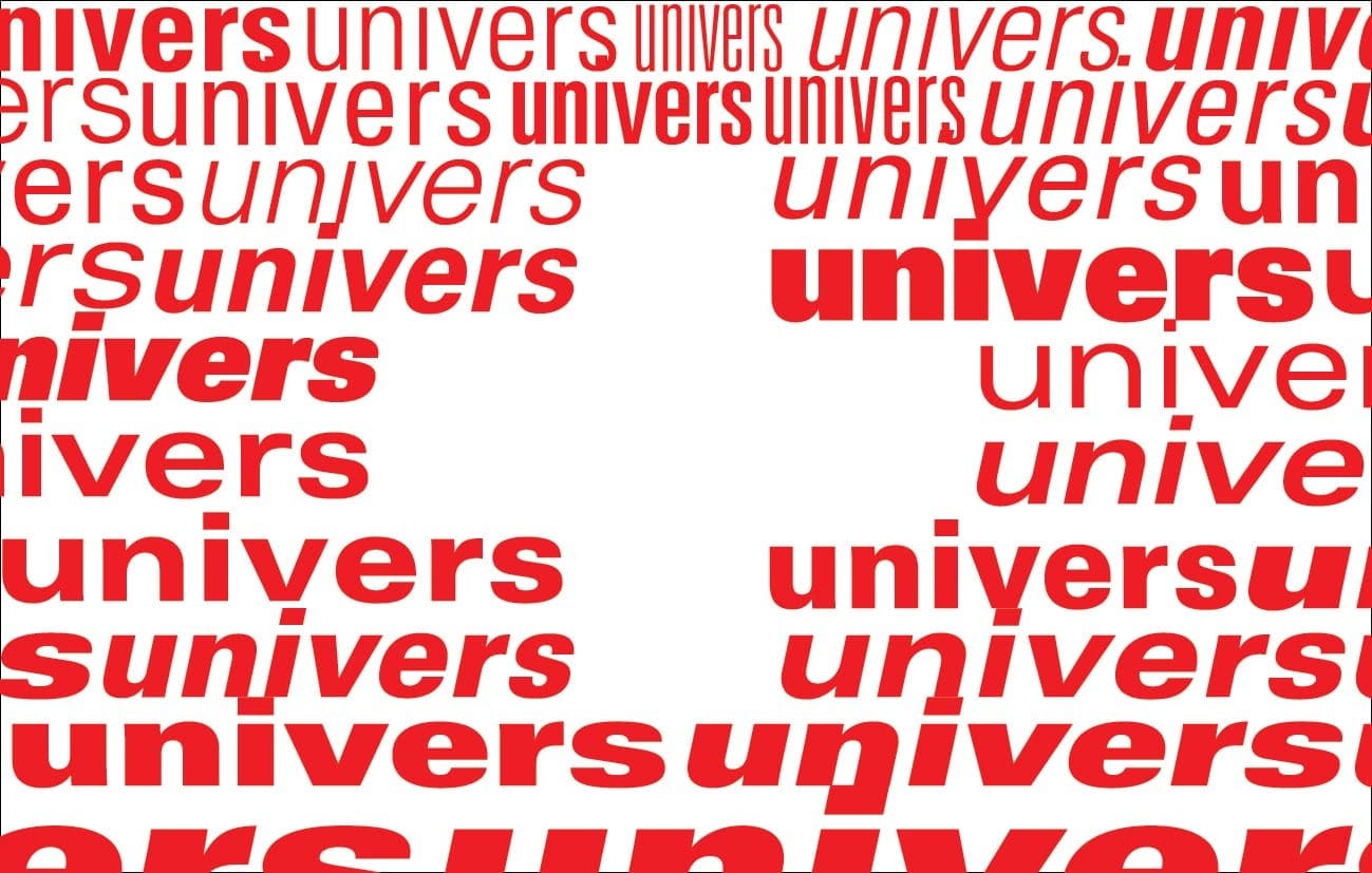
In 1957, Swiss designer Adrian Frutiger introduced the world to Univers, a typeface that would revolutionize the way we see type. Before Univers, sans-serif typefaces were a bit of a free-for-all. Frutiger, however, envisioned a cohesive family of fonts, each with its own unique personality yet unified by a shared visual language.
Univers finds its roots in the neo-grotesque style, drawing inspiration from bold, straightforward 19th-century German typefaces like Akzidenz-Grotesk. Yet, it also embodies the clean, minimalist aesthetic of the renowned Swiss style. Frutiger’s aim was to create a typeface that transcended trends, a design that would remain relevant and adaptable throughout the years.
One of Univers’s most groundbreaking features was its meticulously structured numbering system. Frutiger, a firm believer in practicality, understood the need for designers to easily navigate and distinguish between various font variations. His system assigned a specific number to each weight and width, streamlining the process of selecting the perfect Univers font for any project.
Initially designed for the then-cutting-edge technology of phototypesetting, Univers’s exceptional design and versatility quickly made it a favorite in the printing world. And when the digital age dawned, Univers seamlessly transitioned into the realm of computers, proving its adaptability and enduring relevance. Even today, decades after its creation, Univers remains a go-to choice for designers worldwide, a testament to its timeless appeal and lasting impact on the world of typography.
What is the history of the universal font?
To fully grasp the significance of Univers, we need to travel back to the 1950s when Adrian Frutiger embarked on his typographic journey. Frutiger wasn’t merely creating a font; he was on a mission to design a typeface that could be universally embraced and applied. However, his inspiration didn’t emerge in a vacuum.
Years earlier, in 1925, another visionary designer named Herbert Bayer introduced a typeface called “Universal,” a clear precursor to Frutiger’s creation. Deeply influenced by the minimalist principles of the Bauhaus movement, Bayer advocated for simplicity and clarity in design. His “Universal” typeface, with its sleek, sans-serif style and the absence of separate uppercase and lowercase letters, exemplified this philosophy.
Fast forward to the 1950s, and Frutiger, carrying the torch of Bayer’s vision, set out to create a typeface that embodied those same principles of clarity and simplicity. This endeavor culminated in Univers, a typeface that wasn’t just legible but exceptionally adaptable. Frutiger’s meticulous attention to geometric shapes, clean lines, and a wide array of weights and styles resulted in a typeface that could seamlessly integrate into a multitude of design projects.
Univers quickly became a sensation, adopted by brands, publications, and designers across the globe. Its clean, uncluttered style made it incredibly legible, regardless of its application or audience. The availability of numerous weights and styles further enhanced its versatility, allowing designers to fine-tune its appearance to match any project.
Key Takeaways:
Univers’s design philosophy can be traced back to Herbert Bayer’s “Universal” typeface and the Bauhaus movement, both emphasizing simplicity and functionality.
Frutiger’s meticulous approach to design ensured that Univers was not only visually appealing but exceptionally legible and user-friendly.
The versatility and adaptability of Univers, evidenced by its wide range of weights and styles, contributed to its widespread adoption and enduring popularity.
Interestingly, some typographers suggest that Univers might have influenced the development of other popular typefaces that emerged later. This highlights the evolutionary nature of design and the significant and often unforeseen impact that a single typeface can have on future generations of designers.
Who made Universal typeface?
While Adrian Frutiger’s Univers has become synonymous with the idea of a “universal” typeface, it’s important to acknowledge the roots of this concept. The typeface “Universal,” created in 1925, was the brainchild of Herbert Bayer, a prominent figure in the Bauhaus movement.
Bayer, a student and later the director of printing and advertising at the Bauhaus, was deeply influenced by the school’s philosophy of merging functionality with aesthetics. His “Universal” typeface, characterized by its use of lowercase letters only and geometric forms, was a radical departure from traditional typefaces and reflected the Bauhaus’s embrace of minimalism and technological advancement.
The Bauhaus school’s influence on typography extended far beyond Bayer’s “Universal.” The school championed the use of sans-serif fonts, geometric shapes, and a seamless integration of typography into architectural design. This emphasis on clarity, functionality, and a universal design language has had a lasting impact on the field of typography, shaping the way we think about and use type in various design disciplines.
Frutiger’s Not-So-Secret Recipe for Univers
Frutiger, inspired by Bayer’s vision, sought to create a typeface that embodied the same principles of clarity and simplicity while pushing the boundaries of typographic design. Univers wasn’t just a single font but an entire family of fonts, encompassing various weights, widths, and styles, all meticulously designed to work in perfect harmony. This revolutionary approach provided designers with unprecedented flexibility and control over their typographic choices.
Univers: The Font That Took Over the World (Well, Almost)
Univers’s impact was swift and far-reaching. Designers embraced its timeless elegance, incorporating it into everything from corporate logos and magazine layouts to everyday signage and wayfinding systems. Its enduring appeal lies in its ability to seamlessly blend into a variety of contexts while maintaining its legibility and visual appeal.
What is the closest font to Univers?
If you’re drawn to the clean, modern aesthetic of Univers, you’ll be happy to know that there are several other typefaces that share its signature style. While Univers remains a classic for a reason, exploring these alternatives can open up a world of creative possibilities for your designs.
Familiar Faces and Their Unique Quirks
These fonts are like Univers’s close relatives, each with its own distinct personality traits:
Helvetica: This iconic typeface is a true design superstar. Like Univers, it embraces a straightforward, geometric style that exudes professionalism and sophistication.
Arial: Often described as a hybrid of Helvetica and Univers, Arial offers a familiar and comfortable reading experience. It’s a reliable choice for achieving a clean and legible aesthetic.
Calibri: Developed by Microsoft, Calibri was specifically designed for on-screen readability. This tech-savvy font excels in digital environments.
Myriad: With its graceful curves and elegant flourishes, Myriad adds a touch of sophistication to any design. While maintaining a high level of readability, it offers a more refined and stylish alternative to Univers.
New Kids on the Block: Modern Takes on a Classic
Just as design trends evolve, so do typefaces. These fonts draw inspiration from Univers while incorporating contemporary design sensibilities:
FF DIN: This typeface harkens back to the classic industrial fonts that inspired Univers. Its strong, bold aesthetic makes a powerful statement.
Aktiv Grotesk: With its angular features and contemporary edge, Aktiv Grotesk offers a bolder alternative to Univers’s more neutral design.
Source Sans Pro: Developed by Google, this versatile typeface comes in a wide range of weights and is optimized for on-screen readability across various devices.
Why Explore Beyond Univers?
While Univers remains a timeless and versatile choice, experimenting with alternative typefaces can infuse your designs with fresh perspectives and unique visual identities. Each font possesses its own personality and strengths, allowing you to tailor your typographic choices to the specific mood and message you want to convey.
Wrapping it Up
Ultimately, the best font for your project depends on your specific needs and creative vision. Don’t be afraid to explore the diverse world of typography and discover the fonts that resonate with your personal style and design goals.
Is Univers a Humanist Font?
The question of whether Univers qualifies as a humanist font is an intriguing one. On the one hand, it possesses the clean, geometric structure typical of fonts designed for maximum clarity and efficiency. On the other hand, Univers incorporates subtle curves and variations in stroke width, lending it a warmth and approachability not often found in strictly geometric typefaces.
Frutiger’s meticulous design process is key to understanding Univers’s unique character. His creation of a 21-font system, with carefully calibrated weights and widths, was groundbreaking and set a new standard for the development of comprehensive font families. This systematic approach ensured that each variation of Univers maintained a harmonious relationship with the others, allowing for seamless transitions between different weights and styles within a single design.
Univers’s adaptability has contributed to its widespread use across various design applications. Its clean lines and excellent legibility make it well-suited for everything from logos and headlines to signage and website design. Whether used for large-scale displays or small-screen interfaces, Univers consistently delivers a clear and engaging reading experience.
So, is Univers a humanist font? The evidence suggests that it occupies a fascinating middle ground. It successfully balances its structured, mechanical foundation with a subtle yet perceptible warmth and approachability. This delicate balance has cemented its status as a timeless classic, favored by designers for its versatility, legibility, and enduring visual appeal.
What is a fun fact about Univers font?
Adrian Frutiger originally intended Univers for use on IBM’s Selectric typewriters. Imagine a world where this iconic typeface graced the keys of these ubiquitous machines! However, due to creative differences, IBM ultimately decided against using Frutiger’s design.
Frutiger found a more receptive partner in Deberny & Peignot, who recognized the potential of his typeface and introduced it to the world. This twist of fate highlights the unpredictable nature of design history and how seemingly small events can have a significant impact on the trajectory of a typeface’s success.
Who Invented Univers Font?
As we’ve explored, Univers was the brainchild of Adrian Frutiger, a Swiss typographer who, in 1957, set out to create a typeface that would redefine the landscape of typography. Univers wasn’t simply another font; it was a revolution in typeface design, ushering in a new era of comprehensive font families.
Before Univers, incorporating different font styles into a single design was often a cumbersome and disjointed process. Frutiger’s ingenious solution was to create a typeface that functioned as a cohesive family, with a wide range of weights and widths that seamlessly complemented one another. This innovation provided designers with an unprecedented level of flexibility and control over their typographic choices.
Univers embodied the principles of the Swiss Style of design, a movement characterized by clean lines, a focus on functionality, and a minimalist aesthetic. It quickly became a cornerstone of this design philosophy, embraced for its neutrality, legibility, and ability to convey information with clarity and precision.
The impact of Univers extended far beyond the realm of print design. Its clean, modern aesthetic translated seamlessly to signage, branding, and even digital applications. Even today, Univers continues to be a popular choice for designers seeking a timeless and versatile typeface that can adapt to a variety of contexts.
What is the most universal font?
Determining the “most universal” font is a complex and often subjective endeavor. However, certain fonts, like Univers, have achieved widespread recognition and usage due to their exceptional readability, versatility, and timeless appeal.
Created in the 1950s by Swiss designer Adrian Frutiger, Univers emerged during a period marked by a growing appreciation for clean, modern aesthetics. Frutiger sought to create a typeface that balanced geometric precision with a sense of warmth and approachability. He achieved this by incorporating subtle curves and rounded letterforms, resulting in a typeface that felt both contemporary and inviting.
Univers’s versatility is further enhanced by its wide range of styles, from bold and impactful to light and airy. This extensive selection allows designers to create visual hierarchy, emphasize key information, and establish a consistent tone and voice across various design elements.
While Univers undoubtedly deserves a place among the most widely used and recognized fonts, other contenders, such as Helvetica and Arial, often enter the debate. The concept of “universality” in typography can be interpreted in various ways, considering factors like cross-platform compatibility, cultural acceptance, and historical significance.
Ultimately, the most important aspect of any typeface is its ability to effectively communicate its intended message. While certain fonts may enjoy greater popularity or ubiquity, the best font for a particular project is the one that best aligns with the design goals and target audience.
What is the history of the Jost font?
Jost, a relatively new addition to the world of typography, offers a fresh perspective on the geometric sans-serif style. Created in 2017 by Indestructible Type, Jost was initially released under the name “Renner” as a tribute to renowned typographer Paul Renner. However, in 2018, the font underwent a name change to honor another influential figure in typography, Heinrich Jost.
The inspiration for Jost can be traced back to the classic German sans-serif fonts of the 1920s, known for their geometric precision and functional aesthetic. Indestructible Type recognized the need for a typeface that captured the essence of these classic designs while being optimized for the demands of digital displays.
In 2020, Owen Earl and Mirko Velimirovic further enhanced Jost’s versatility by converting it into a variable font format. This technological advancement allowed for greater flexibility in adjusting the font’s weight and width, making it even more adaptable to a wider range of design applications.
Jost’s key features include nine distinct weights, ranging from delicate Hairline to bold Black, support for multiple languages, including Cyrillic, and the inclusion of stylistic alternatives and both tabular and proportional numbers. Its highly geometric design, characterized by its near-perfectly circular “O,” gives it a clean and contemporary feel.
Jost stands as a testament to the enduring influence of classic typographic styles while embracing the possibilities offered by modern font technology. Its versatility, legibility, and digital optimization make it an excellent choice for designers seeking a typeface that can seamlessly transition between print and digital mediums.
What is the history of the Jokerman font?
Jokerman, a decorative typeface created in 1995, is instantly recognizable for its whimsical and playful aesthetic. Designed by Andrew K. Smith, Jokerman’s distinctive style is characterized by its use of dots, spirals, and straight lines that embellish each character, creating a sense of movement and energy.
The typeface’s name, as you might have guessed, was inspired by Bob Dylan’s song “Jokerman.” Smith’s design captures the song’s themes of humor, vitality, and a touch of mischief.
Jokerman’s unique personality has made it a popular choice for businesses looking to convey a sense of fun and lightheartedness. It’s often found in signage and branding for coffee shops, juice bars, and other establishments that aim to create a welcoming and cheerful atmosphere.
International Typeface Corporation offers two main variations of Jokerman: the classic Jokerman and Jokerman Hellenic. The latter includes glyphs for the Greek alphabet, expanding its reach to a wider range of linguistic contexts.
What is the oldest font still used today?
The quest for the oldest font still in use takes us on a fascinating journey through the history of typography. While pinpointing the absolute oldest is a complex task, certain typefaces have stood the test of time, their designs echoing through the centuries.
Trajan, inspired by the majestic Roman inscriptions found on Trajan’s Column (constructed around 100 CE), is a testament to the enduring power of classic letterforms. Its formal, uppercase-only design evokes a sense of grandeur and importance, often used for movie titles, book covers, and other applications where a sense of history and gravitas is desired.
Bembo, a typeface that rose to prominence during the Italian Renaissance, offers a harmonious blend of Roman letterforms and calligraphic influences. Its elegant yet legible design has made it a favorite for centuries, used extensively in books, posters, and other printed materials.
Bodoni, created in 1798 by Giambattista Bodoni, represents the pinnacle of neoclassical typeface design. Inspired by the work of the Didot family, Bodoni is characterized by its sharp contrast between thick and thin strokes, creating a dramatic and sophisticated aesthetic. Its enduring popularity is a testament to its timeless elegance and versatility.
While these fonts have ancient roots, it’s important to remember that the concept of a “font” has evolved significantly over time. Early forms of writing were painstakingly carved or hand-drawn, each letter a unique creation. The invention of the printing press marked a turning point, leading to the standardization of letterforms and the emergence of typefaces as we know them today.
The digital age has further transformed the way we create, categorize, and use fonts. Determining the absolute oldest font in use requires navigating the complexities of evolving technologies, changing definitions, and the enduring legacy of ancient writing systems. Nevertheless, the fact that we still use and appreciate typefaces inspired by the work of artisans and scribes from centuries past highlights the timeless appeal of well-crafted letterforms and their ability to transcend time and technology.
Hello, My love for writing is rivaled only by my passion for in-depth research. While many may skim the surface, I dive deep, seeking the hidden gems of information that give a story texture and depth. Every word I write is backed by hours of exploration, ensuring that my work is not just compelling, but also meticulously accurate. Join me on a journey where every piece is a deep dive into the realms of knowledge and storytelling.


")