Buckle up, skate fans! We’re about to drop some knowledge bombs about Santa Cruz Skateboards, one of the gnarliest brands out there. From the iconic screaming hand to their humble roots, we’re going to dive deep into the history of this skateboarding titan. We’ll explore the origins of their eye-catching logo and uncover the intriguing link between their decks and bikes. So, whether you’re a shredding pro or just curious about where the wheels started rolling, get ready for a mind-blowing ride!
Picture this: It’s 1973, and the California surf scene is booming. Nestled in the heart of it all is a little company called NHS, crafting surfboards for wave riders. But little did they know, they were about to make history in a whole different arena – skateboarding.
NHS wasn’t content with simply making boards; they wanted to push boundaries and redefine what was possible. In the mid-1970s, they had a stroke of genius – why not use precision ball bearings for skateboard wheels? It might seem obvious now, but back then, it was a game-changer. Suddenly, skateboards were faster, smoother, and infinitely more enjoyable to ride. The impact was undeniable, and it wasn’t long before other brands followed suit, forever altering the trajectory of skateboarding.
But NHS’s innovative spirit didn’t stop there. Jay Shuirman, one of the founders, was a visionary in his own right. He played a pivotal role in the creation of Independent Trucks, a revolutionary design that set a new standard in skateboarding. These trucks provided unparalleled responsiveness and control, quickly becoming the industry gold standard. To this day, Independent Trucks are a testament to Shuirman’s lasting impact on the skateboarding world.
As the years rolled on, Tim Puimarta emerged as a key figure at NHS, driving innovation with the same fervor as his predecessors. He was the mastermind behind Everslick, a super-slick coating that enhanced board speed and durability. Then came the upturned nose, a seemingly minor tweak that revolutionized skateboarding. This subtle design change gave riders more control and opened up a world of new possibilities for tricks and maneuvers.
NHS was a hotbed of experimentation, always on the lookout for the next big thing. They introduced Cell Blocks, those stackable risers that allowed skaters to customize their rides, and Black Top boards with their durable fiberglass top layer. These innovations, along with countless others, showcased NHS’s deep understanding of skateboarders’ needs and desires.
Santa Cruz Skateboards has been, and continues to be, a driving force in skateboarding’s evolution. From their early days to today, they haven’t stopped pushing the limits, earning them a well-deserved reputation as one of the most respected names in the game. They’re more than just a company; they’re a part of skateboarding history, and their influence is likely to inspire generations to come.
What is the history of the Santa Cruz skateboard logo?
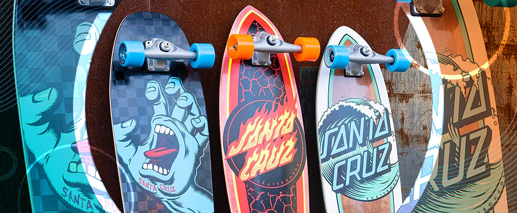
Speaking of Santa Cruz, let’s talk about their iconic logo, a symbol instantly recognizable in the skateboarding world. It’s hard to imagine skateboarding without it, but have you ever wondered about its origins? Who dreamt up the screaming hand in a red circle that has become synonymous with skateboarding?
The creative genius behind it is Jim Phillips, a surfer, skater, and exceptionally talented artist who captured the very essence of skateboarding in his work. In 1978, he crafted the first iteration of the Santa Cruz logo – a simple yet stylish design featuring the brand name in a slanted font. While it was a solid start, it lacked the visual punch that would later define the brand.
Then, in 1985, Phillips unleashed the red circle upon the world, and everything changed. This seemingly simple addition, with “Santa Cruz Skateboards” boldly inscribed beneath the screaming hand, transformed the logo into an emblem of skateboarding culture. The red circle became a visual shorthand for the boldness, rebellion, and unstoppable spirit that skateboarding embodied.
Interpretations of the screaming hand’s symbolism abound. Some view it as a representation of the raw energy and passion that fuels skaters, while others see it as a symbol of frustration and defiance against societal norms. Could those splayed fingers be a silent protest against the rules and expectations that skaters often rejected? The beauty of the design lies in its open-ended nature, allowing for personal interpretations and connections.
Over the years, the Santa Cruz logo has undergone subtle tweaks, yet its core elements – the screaming hand and the bold red circle – have remained constant. This unwavering commitment to its iconic design is a testament to its timeless appeal and enduring power. It’s a symbol that transcends generations, capturing the rebellious spirit and fierce individuality that lie at the heart of skateboarding.
And let’s not forget the countless legendary skaters and events that Santa Cruz has been a part of – the logo has been there through it all, a silent witness to skateboarding’s evolution. It’s more than just a logo; it’s a badge of honor, a symbol of skateboarding history, and a reminder of how far this creative and unconventional world has come.
Are Santa Cruz Skateboards and Bikes the Same Company?
It’s easy to see the name “Santa Cruz” on a skateboard and then spot it again on a mountain bike and wonder if they’re connected. It’s a question that pops up often, and the answer is both yes and no.
Both Santa Cruz Skateboards and Santa Cruz Bicycles owe their existence to a single individual, Rich Novak, a man with a passion for action sports and a deep connection to Santa Cruz, California. However, while they share a common ancestor and a namesake, their paths diverged, leading to two distinct entities.
Santa Cruz Skateboards, founded in 1973, is a venerable presence in the skateboarding world – a pioneer with a rich history of innovation and a legacy built on iconic graphics and legendary riders. Their focus has always been on the thrill of the streets, the concrete waves, and the freedom of four wheels beneath your feet.
Fast forward two decades to 1993, and we find Novak venturing into new territory – the rugged and demanding world of mountain biking. This marked the birth of Santa Cruz Bicycles, a company driven by a desire to push the limits of two-wheeled adventure. They quickly earned a reputation for crafting high-performance bikes designed to conquer trails and redefine what’s possible on two wheels.
While they share a common origin story, Santa Cruz Skateboards and Santa Cruz Bicycles have carved their own paths, each with distinct owners, goals, and target audiences. They’re like siblings who grew up under the same roof but developed unique personalities and passions along the way. To illustrate:
Company
Founded
Owned by
Focus
Santa Cruz Skateboards
1973
NHS, Inc.
Skateboarding
Santa Cruz Bicycles
1993
Pon Holdings
Mountain Biking
So, there you have it – two companies, one name, a shared history, but ultimately, separate journeys. They stand as a testament to the power of entrepreneurial spirit and the enduring legacy of a name synonymous with quality and innovation in both the skateboarding and cycling worlds.
Are Creature and Santa Cruz the same company?
Creature and Santa Cruz skateboards often share shelf space in skate shops, leading to some understandable confusion about their relationship. While they are indeed separate brands each with its own unique identity, they both operate under the umbrella of a larger parent company, NHS, Inc.
Think of NHS as a skateboarding powerhouse, overseeing a family of brands that cater to different niches within the skateboarding world. Creature, established in 1994 by Jim Thiebaud, has carved a unique niche with its bold, in-your-face graphics inspired by horror movies and monster lore. If you’re drawn to the darker side of skateboarding and love to shred streets and parks, Creature decks are built to handle it all with style.
Santa Cruz, on the other hand, boasts a much longer history, tracing its roots back to 1973. This skateboarding veteran has had ample time to experiment and evolve, resulting in a diverse range of styles that encompass everything from classic surf vibes to, yes, even a few skull-themed designs. Santa Cruz offers a little something for every skater, with a variety of shapes and sizes tailored to suit different riding styles, whether you prefer the vert ramp, the smooth curves of a bowl, or something in between.
Here’s a handy table to break it down:
Feature
Creature Skateboards
Santa Cruz Skateboards
Founded
1994
1973
Graphics
Horror-inspired
Diverse, including surf & skate
Focus
Street & Park skating
Wide range of skating styles
Price
Often slightly higher
Offers a range of prices
When it comes to price, Creature boards sometimes come with a slightly higher price tag than some competitors, potentially due to their unique designs and dedication to high-quality construction. Santa Cruz, with its broader range of offerings, caters to various budgets, making it easier to find a board that aligns with your financial comfort zone.
Ultimately, the best way to determine which brand truly resonates with your skating style is to experience them firsthand. Head to your local skate shop, feel the different boards beneath your feet, and trust your instincts. After all, skateboarding is all about self-expression and finding the perfect setup that allows you to ride with confidence and style.
Where is Santa Cruz Skateboards based?
The name “Santa Cruz Skateboards” just rolls off the tongue, doesn’t it? It evokes images of sun-drenched California beaches, the rumble of skateboard wheels on pavement, and the spirit of rebellious youth. And it’s no accident – Santa Cruz Skateboards is as deeply rooted in its namesake city as the iconic Screaming Hand is ingrained in skateboarding culture.
Since their inception in 1973, Santa Cruz, California, has been more than just a headquarters for the company – it’s their spiritual home, their testing ground, and an endless source of inspiration. And we’re not talking about some sterile corporate office park; their headquarters at 825 41st Avenue is a veritable pilgrimage site for skateboard enthusiasts.
Imagine stepping into a world where skateboarding history comes to life. A museum showcases a treasure trove of gnarly graphics and iconic decks that have defined generations of skateboarding, while a well-stocked shop offers a chance to score exclusive Santa Cruz swag. But it’s the intangible that truly sets this place apart – the palpable energy, the echoes of skateboarding legends, and the undeniable sense that you’re standing on hallowed ground.
Santa Cruz Skateboards is deeply invested in its community, giving back to the place that has given them so much. They’re the driving force behind local skateparks, the sponsors of rad events that bring the community together, and staunch supporters of young skaters finding their footing (or should we say, wheels?) in the world of skateboarding. Their presence is woven into the very fabric of Santa Cruz, a testament to their commitment to fostering skateboarding culture at its roots.
Here’s a snappy summary:
Born and raised: Santa Cruz Skateboards and Santa Cruz, California – inseparable since ’73.
HQ = Holy Grail: 825 41st Avenue isn’t just an address, it’s a shrine to skate culture.
More Than Decks: Santa Cruz is deeply invested in nurturing the local skateboarding scene, from parks to youth programs.
Santa Cruz Skateboards is more than just a brand; it’s a living testament to the power of staying true to your roots and fueling the passion that keeps skateboarding rolling, generation after generation.
What does the Santa Cruz screaming hand mean?
Let’s dive deeper into the mystery of the Santa Cruz Screaming Hand, a symbol that has captivated and intrigued skateboarders and non-skaters alike since its creation in 1978. This iconic image – a severed hand, mouth agape in a silent scream – is more than just a cool design; it’s a powerful symbol of rebellion, self-expression, and the raw energy of youth.
The Screaming Hand’s brilliance lies in its simplicity and open-ended nature. There’s no single, definitive interpretation, allowing individuals to project their own experiences and emotions onto it. Some see it as a visual representation of the frustrations of youth, a scream against the constraints of societal norms and expectations. Others interpret it as a symbol of creative energy, a force bursting forth from within, demanding to be heard.
While skateboarding is undoubtedly at the heart of the Screaming Hand’s meaning, its influence extends far beyond the ramps and streets. It has become a powerful emblem for anyone who has ever felt like an outsider, a misfit, or simply different. It’s a symbol of individuality, a reminder to embrace what makes you unique and shout it from the rooftops, even if it’s just a silent scream.
The Screaming Hand’s enduring appeal lies in its ability to evolve and adapt over time, taking on new meanings as it’s passed down through generations. It has transcended its skateboarding origins to become a cultural icon, appearing on everything from clothing and backpacks to art and tattoos. It’s a testament to the power of a single image to capture the spirit of a generation and resonate with people from all walks of life.
The Screaming Hand is a reminder that sometimes, the most powerful statements are made without words. It’s a symbol of defiance, a declaration of individuality, and a timeless expression of the raw energy that drives us all.
What does Santa Cruz stand for?
The name “Santa Cruz” itself holds a deeper meaning, reflecting the rich history of the California coast. “Santa Cruz” is Spanish for “Holy Cross,” a nod to the region’s deep-rooted Spanish heritage. Think back to the 17th and 18th centuries when Spanish explorers first charted the California coastline. Their voyages were about more than just exploration; they sought to establish a presence, leaving their mark on this new land.
Spanish missionaries played a pivotal role in this endeavor, establishing missions and spreading their Catholic faith throughout the region. These missions became centers of religious, cultural, and social life, leaving an indelible mark on the landscape and culture of California. When the name “Santa Cruz” was spoken, it evoked not just a geographical location but a symbol of faith, exploration, and the enduring legacy of the Spanish presence.
Today, the name “Santa Cruz” continues to embody this rich history. It represents the fusion of cultures and the unique blend of Spanish and Californian influences that shape the region’s identity. Each time we hear the name, we are reminded of the intrepid explorers, the dedicated missionaries, and the enduring power of faith and exploration. It serves as a testament to the enduring legacy of the past and its influence on the present.
What does the Element Skateboards logo mean?
Element Skateboards, with its instantly recognizable logo, has become synonymous with a skateboarding ethos deeply connected to nature. The logo, featuring a tree enclosed within a circle, speaks to the harmonious relationship between skateboarding and the environment. It’s a visual reminder that skateboarding is not just about concrete, metal, and asphalt but also about embracing the natural world.
The tree, a symbol of strength, wisdom, and resilience, represents the enduring power of nature. Just as a tree weathers storms and stands tall through the changing seasons, skateboarders, too, face challenges head-on, learn from their falls, and rise to conquer new obstacles. The circle, a universal symbol of unity and wholeness, represents the interconnectedness of all things, reminding us that we are all part of something larger than ourselves.
Some interpretations link the circle to the four classical elements: earth, wind, fire, and water. Earth provides the solid foundation beneath our feet, wind propels us forward as we gain speed, fire represents the burning passion that fuels our pursuits, and water, while perhaps less obvious, reminds us that even in the face of inevitable wipeouts, we can rise again, refreshed and ready to try again.
Ultimately, the true meaning of the Element Skateboards logo lies in the eye of the beholder. It’s a symbol open to interpretation, allowing each individual to find their own meaning and connection to the brand’s ethos of environmental respect and mindful skateboarding.
What does the Deathwish skateboard logo mean?
The Deathwish skateboard logo, a simple yet striking cross, commands attention and sparks curiosity. Its backstory is as edgy and rebellious as the skateboarders who ride under its banner.
The logo takes inspiration from the symbol sported by a street punk gang in the 1985 cult classic film “Death Wish 3.” The film, known for its gritty realism and vigilante themes, resonated with a generation disillusioned with societal norms, and Deathwish Skateboards seems to tap into that same vein of rebellious spirit.
The cross itself is open to interpretation, adding to the logo’s intrigue. Some see it as a symbol of danger and risk, reflecting the inherent thrill-seeking nature of skateboarding. Others interpret it as a bold statement of defiance, a visual representation of going against the grain and challenging the status quo.
The Deathwish logo is the brainchild of Mark Foster, a renowned designer in the skateboarding world with a knack for capturing the raw energy and rebellious spirit of the sport. Foster’s portfolio includes iconic logos for other prominent skate brands, including Alta Mont and Heroin skateboards, solidifying his status as a visionary in skateboarding aesthetics.
What are the colors of the Santa Cruz logo?
The Santa Cruz logo, an instantly recognizable emblem in skateboarding and beyond, derives its visual impact from a carefully chosen color palette – Santa Cruz blue, white, and black. This classic trifecta, used strategically throughout the brand’s various logo iterations, creates a sense of boldness, timelessness, and visual appeal.
The “Screaming Hand,” for instance, is often rendered in blue, occasionally white, set against a stark black background, or vice versa. This high-contrast approach makes the logo pop, instantly grabbing the viewer’s attention. The “Red Dot” logo, another Jim Phillips creation, utilizes a bold red circle as its defining element. While red occupies a relatively small portion of the overall design, its vibrancy draws the eye and adds a sense of urgency and energy.
Although the official reasoning behind the color choices remains a mystery, speculation abounds. Some theorize that the blue represents the vast Pacific Ocean, a nod to Santa Cruz’s renowned surfing culture. Black and white, in this context, could symbolize the asphalt and the lines of a skateboard, grounding the brand’s visual identity in the physical act of skateboarding. Whether these theories hold weight or not, they showcase the power of color to evoke emotions, spark associations, and contribute to a brand’s lasting impact.
The Santa Cruz logo’s colors are more than just aesthetic choices; they are carefully calculated elements that contribute to the brand’s identity and appeal. They are instantly recognizable, synonymous with the brand’s rebellious spirit, and a testament to the power of color to tell a story without uttering a single word.
What is special about Santa Cruz?
Santa Cruz isn’t just another California beach town; it’s a state of mind, a feeling, a way of life. Imagine a place where the air is thick with the scent of salt and pine, where the sound of crashing waves provides a constant soundtrack, and where a laid-back vibe permeates every aspect of life. That’s Santa Cruz in a nutshell – a place where you can truly be yourself, whether you’re a surfer dude, a tech entrepreneur, or just someone who appreciates a good sunset and a cold craft beer.
Santa Cruz is a haven for outdoor enthusiasts, with a plethora of activities to satisfy every adventurous spirit. Surfing is practically a religion here, and the beaches are legendary, attracting everyone from seasoned pros to wide-eyed beginners eager to experience the thrill of riding the waves. If you prefer to stay dry, the Santa Cruz Mountains beckon, offering miles of hiking trails through towering redwood forests, some of the oldest and most majestic living things on earth.
But Santa Cruz is more than just a pretty face; it boasts a vibrant cultural scene that will captivate your senses. The downtown area is a melting pot of independent businesses, art galleries, and restaurants serving up everything from vegan burritos to Michelin-star-worthy seafood. You’ll find a palpable sense of community here, a shared love for the outdoors, and a deep appreciation for the arts.
Here’s a glimpse into what makes Santa Cruz so special:
Feature
Description
Natural Beauty
Pristine beaches, towering redwood forests, scenic hiking trails, and breathtaking views of the Monterey Bay.
Vibrant Culture
Thriving local businesses, a diverse and eclectic food scene, a lively arts and music scene, and a calendar packed with festivals and cultural celebrations.
Sustainability
A strong commitment to environmental protection, with miles of bike paths, a focus on local and organic food, and numerous initiatives to reduce waste.
Outdoor Recreation
Endless opportunities for surfing, kayaking, stand-up paddleboarding, hiking, biking, and exploring the great outdoors.
Rich History
Well-preserved Victorian architecture, fascinating local museums, and cultural attractions that tell the story of Santa Cruz’s unique past.
Santa Cruz is a place that defies easy categorization. It’s a unique blend of natural beauty, laid-back vibes, and a touch of that intangible California magic. It’s a place where you can reconnect with nature, explore your creative side, and find a sense of community that’s hard to come by elsewhere.
For more insights into captivating histories, delve into the intriguing history of self-compacting concrete, a remarkable innovation that has revolutionized the construction industry. Additionally, explore the history of St Barths, a captivating Caribbean island with a rich and intriguing past.
Hello, My love for writing is rivaled only by my passion for in-depth research. While many may skim the surface, I dive deep, seeking the hidden gems of information that give a story texture and depth. Every word I write is backed by hours of exploration, ensuring that my work is not just compelling, but also meticulously accurate. Join me on a journey where every piece is a deep dive into the realms of knowledge and storytelling.