Meet Clarendon, a typeface that’s stood the test of time, captivating designers for nearly two centuries. Created in 1845, Clarendon possesses an allure that transcends fleeting trends. This typeface effortlessly blends vintage charm with modern sensibility, making it a favorite for everything from bold headlines to elegant book designs. Join us as we embark on a typographic journey, exploring the rich history, distinctive features, and enduring legacy of Clarendon.
History of the Clarendon Typeface: A Blast from the Past
Journey back to 1845, a time when type design was undergoing a revolution. Amidst this creative fervor, Robert Besley, a talented engraver at the Thorowgood and Co. foundry in London, brought forth a typeface that would forever alter the landscape of typography – Clarendon.
Commissioned by the esteemed Clarendon Press, this innovative typeface quickly gained recognition for its distinct characteristics. Bold, sturdy letterforms paired with pronounced, slab-like serifs set Clarendon apart from its predecessors, forging a new path in type design. The Clarendon Press, known for its high-quality publications, recognized the typeface’s clarity and impact, adopting it for their own printed works.
However, Clarendon’s influence was not limited to the hallowed halls of academia. Its versatility soon became apparent, appearing on everything from advertisements and signage to the iconic wanted posters of the American Old West. This adaptability cemented Clarendon’s status as a typeface for the people, equally at home in both formal and informal settings.
But Clarendon’s pioneering spirit didn’t stop there. It made history by becoming the very first typeface protected by copyright under Britain’s Ornamental Designs Act of 1842. This landmark achievement paved the way for the protection of typographic creations, forever changing the landscape of the field.
Today, Clarendon’s legacy lives on. Designers still gravitate towards its timeless appeal, utilizing it in a myriad of contemporary projects. From sleek websites to eye-catching logos, Clarendon effortlessly bridges the gap between classic and modern, proving that good design truly stands the test of time.
What is the history of the Clarendon URW font?
Let’s delve deeper into the Clarendon family tree, focusing on a specific branch – Clarendon URW. This widely recognized variation of the typeface emerged from the renowned URW Type Foundry, founded by Peter Unger, Rolf Ruwe, and Günter Winnen in Hamburg, Germany.
URW gained prominence for its meticulous work in digitizing classic typefaces, breathing new life into beloved designs for the digital age. Among their many accomplishments, their rendition of Clarendon, aptly named Clarendon URW, stands out as a testament to their expertise.
Hermann Eidenbenz, a renowned Swiss typographer, played a pivotal role in the development of Clarendon URW. Working alongside URW, Eidenbenz meticulously reworked the original Clarendon design, enhancing its functionality and expanding its stylistic range for contemporary use. The result is a versatile typeface family encompassing a wide array of weights, widths, and styles, offering designers a comprehensive toolkit for creative expression.
Clarendon URW’s success lies in its ability to capture the essence of the original typeface while seamlessly integrating modern sensibilities. This careful balance has solidified its position as a go-to choice for designers seeking a typeface that exudes both classic elegance and contemporary flair.
What are the characteristics of the Clarendon font?
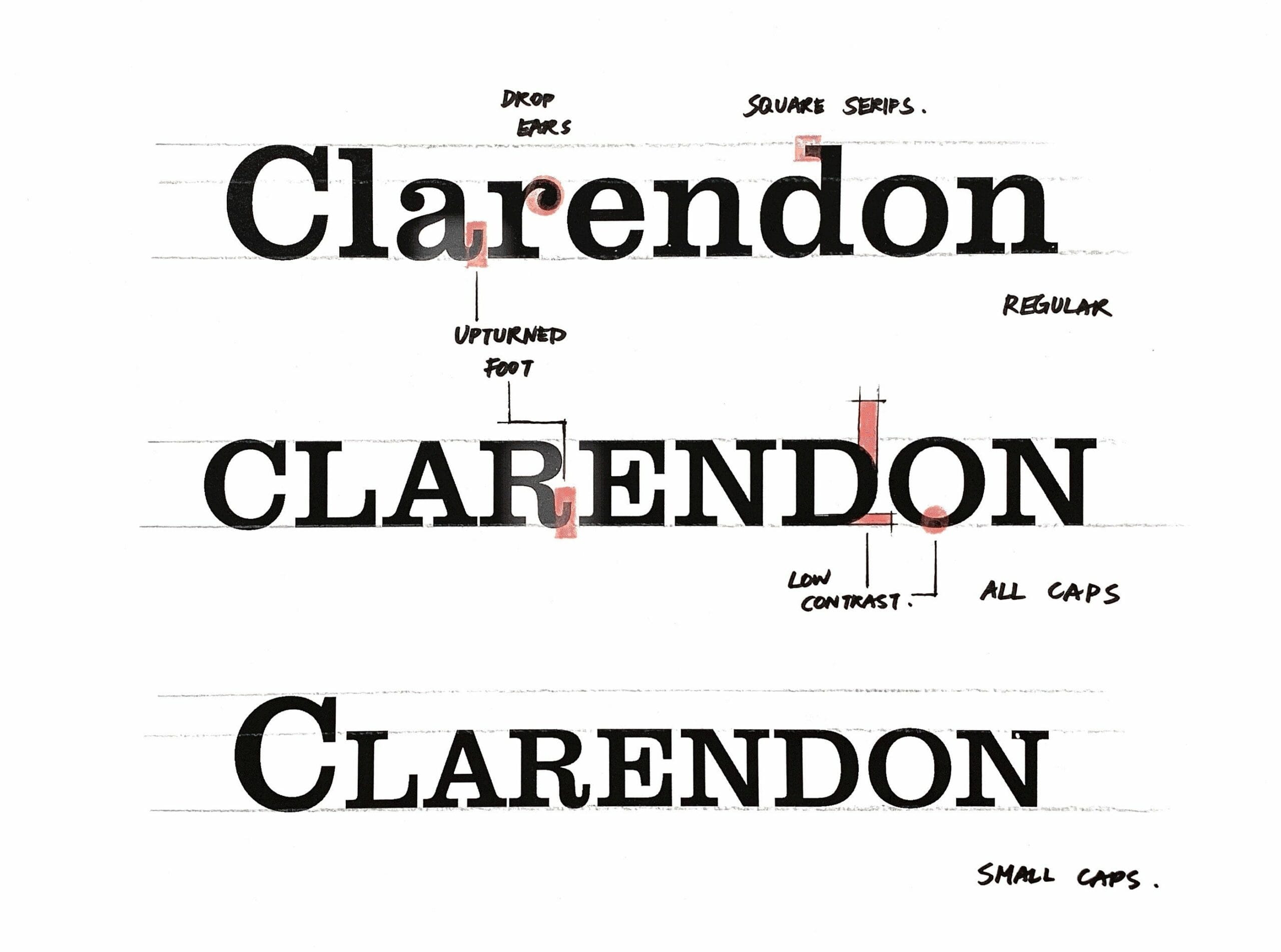
Clarendon’s enduring appeal lies in its distinctive design elements, expertly balanced to create a typeface that is both robust and refined. Let’s break down the key characteristics that define this iconic typeface:
1. Slab Serifs: Clarendon falls under the category of slab-serif typefaces, characterized by bold, rectangular serifs. Unlike the delicate, often tapered serifs found in traditional typefaces, Clarendon’s serifs make a bold statement, adding visual weight and a sense of solidity to each letterform.
2. Bracketed Serifs: Adding a touch of elegance, Clarendon’s serifs are bracketed, meaning they curve slightly where they meet the main stroke of the letter. This subtle detail softens the overall appearance, creating a more harmonious and visually appealing aesthetic.
3. Strong Contrast: The interplay between thick and thin strokes within each letterform is another defining characteristic of Clarendon. This pronounced contrast contributes to its legibility, making it easily discernible at various sizes and across different mediums.
4. Geometric Construction: Underlying Clarendon’s design is a strong sense of geometric construction. Letterforms often exhibit a slightly condensed structure, with circular elements, like the bowls of ‘o’ or ‘p’, adhering to a more geometric shape. This calculated approach enhances Clarendon’s versatility, allowing it to seamlessly transition from formal to informal contexts.
5. Versatility in Application: Clarendon’s enduring popularity stems from its ability to effortlessly adapt to a wide range of design applications. Whether used for headlines, body text, logos, or signage, Clarendon consistently delivers a message of clarity, authority, and timeless elegance.
Is Clarendon a modern typeface?
While Clarendon’s roots reach back to 1845, its relevance in contemporary design sparks an intriguing question: Is Clarendon a modern typeface? The answer, like the typeface itself, is multifaceted.
From a purely historical perspective, Clarendon predates what is typically considered the “modern era” of typography. It emerged during a time when type design was heavily influenced by the burgeoning Industrial Revolution and a desire for clear, legible typefaces suitable for mass printing.
However, Clarendon’s enduring popularity suggests that its appeal transcends temporal boundaries. Designers continue to embrace Clarendon for its versatility, finding fresh and innovative ways to incorporate its distinctive aesthetic into contemporary projects. This sustained relevance speaks to Clarendon’s ability to adapt and evolve alongside design trends, proving that its timeless elegance is not bound by a specific era.
Several factors contribute to Clarendon’s modern sensibility. Its clean lines, geometric construction, and bold, impactful letterforms resonate with the minimalist aesthetics often favored in contemporary design. Additionally, the availability of numerous digital interpretations and variations of Clarendon provides designers with a vast toolkit to explore and experiment, further cementing its place in the modern typographic landscape.
So, while Clarendon may not fit the strict definition of a “modern typeface” based on its date of creation, its enduring presence and continued relevance in contemporary design firmly establish it as a typeface that feels surprisingly current and undeniably timeless.
What font is closest to Clarendon?
Clarendon’s distinct blend of boldness and elegance has inspired numerous typefaces over the years. If you’re seeking a font that captures a similar aesthetic but offers a unique twist, here are a few noteworthy alternatives to explore:
1. Didot: This elegant typeface shares Clarendon’s appreciation for strong contrasts and geometric construction. Didot, however, leans into a more refined and sophisticated aesthetic, often favored for high-end fashion magazines or luxury branding.
2. Bodoni: Similar to Didot, Bodoni possesses a timeless elegance and a penchant for dramatic contrasts. Bodoni’s letterforms tend to be slightly more condensed than Clarendon’s, offering a more space-efficient option for headlines or display text.
3. Ibarra: For projects seeking a touch of whimsy, Ibarra offers a delightful alternative. While it retains the bold serifs and clear letterforms characteristic of Clarendon, Ibarra incorporates delicate swash capitals and a more fluid design, adding a touch of personality and flair.
4. Adobe Jenson: Bridging the gap between classic and contemporary, Adobe Jenson draws inspiration from Clarendon’s timeless appeal while incorporating subtle modern updates. Its versatility makes it an excellent choice for a wide range of design projects, from book covers to website layouts.
5. Nexa: While technically a sans-serif typeface, Nexa deserves a spot on this list for its undeniable Clarendon-esque qualities. Nexa embraces bold letterforms, condensed spacing, and a geometric sensibility, offering a modern take on Clarendon’s enduring charm.
These are just a few examples of the many typefaces that share similarities with Clarendon. The beauty of typography lies in its vast and ever-evolving landscape. Don’t hesitate to explore different font libraries and discover new favorites that capture the essence of Clarendon’s timeless appeal.
What is the oldest font in the world?
While pinpointing the absolute oldest font in the world is a task riddled with complexities, one contender often emerges in discussions about early typography – and no, it’s not Clarendon. The honor, at least according to current knowledge, belongs to a typeface known as Blackletter, sometimes referred to as Gothic or Old English.
Blackletter’s origins can be traced back to the 12th century, where it emerged in Europe as a dominant style of writing and, later, printing. Its characteristically dense, ornate letterforms, often resembling the strokes of a broad-tipped calligraphy pen, were widely used in manuscripts and early printed books.
The most famous example of Blackletter in action is undoubtedly the Gutenberg Bible, printed around 1455 by Johannes Gutenberg. This groundbreaking work, considered the first book printed in Europe using movable type, employed a Blackletter typeface similar to a style known as Textura.
It’s important to note that Blackletter’s history is not without its share of ambiguity. Determining a single, definitive “oldest font” becomes even more convoluted when considering the evolution of writing systems across different cultures and throughout history. However, based on current scholarly understanding, Blackletter holds a strong claim to this prestigious title, representing a pivotal moment in the development of typography and the dissemination of knowledge through the printed word.
Is Clarendon an Adobe font?
While Adobe offers a vast library of typefaces, Clarendon does not fall under their umbrella of creations. As previously discussed, Clarendon’s origins predate the existence of Adobe by well over a century.
Born in 1845, Clarendon emerged from the Fann Street Foundry in London, later becoming associated with the Thorowgood and Co. foundry. Its creation marked a significant moment in typographic history, not only for its distinctive design but also for its status as the first typeface to receive copyright protection.
Adobe, founded in 1982, has played a pivotal role in shaping the landscape of digital typography. However, their focus has primarily been on developing new typefaces and acquiring licenses for existing ones, rather than claiming ownership of historical designs like Clarendon.
Despite not being an Adobe font, Clarendon remains readily available to designers through various online foundries and font distributors. Its enduring popularity has ensured its continued presence in the digital realm, allowing designers to incorporate its timeless elegance into a wide array of modern projects.
What does URW font stand for?
The acronym URW, frequently encountered in the world of digital typography, represents the initials of the three individuals who founded the renowned type foundry – Unger, Ruwe, and Winnen.
Established in Hamburg, Germany, URW Type Foundry quickly gained recognition for its pioneering work in digital type design. The company played a pivotal role in transitioning classic typefaces from the realm of metal type to the digital age, ensuring their continued relevance and accessibility for a new generation of designers.
URW’s contributions extend far beyond simply digitizing existing typefaces. They’ve also developed an extensive library of original typefaces, encompassing a wide range of styles and design aesthetics. Their commitment to quality and innovation has solidified their position as a respected and influential force in the world of typography.
When you encounter a font with the URW designation, you can be confident that it originates from a company with a rich history of typographic excellence. Their dedication to preserving classic designs while pushing the boundaries of digital type design has made them a go-to resource for designers seeking high-quality, meticulously crafted typefaces.
What is the history of the Centennial font?
While tracing the precise lineage of every typeface can be a complex endeavor, certain typefaces, like Centennial, clearly wear their inspirations on their sleeve. Centennial, a bold, robust typeface often associated with the American West, draws heavily from the design principles established by Clarendon, but with its own unique twists and turns along the way.
Picture those iconic Western movie posters, the ones advertising dusty saloons and showdowns at high noon. The typefaces used in these posters often channeled the spirit of Clarendon, with its bold, attention-grabbing letterforms and a sense of rugged individualism. This stylistic connection is no coincidence.
Centennial, while not a direct descendant of Clarendon, undeniably borrows from its design language. The influence is evident in its sturdy serifs, often exaggerated for a more pronounced visual impact, and its overall sense of boldness and clarity.
However, Centennial is not merely a Clarendon imitation. It carves its own path with subtle variations in letterform design, stroke weight, and overall proportions, resulting in a typeface that feels both familiar and distinct.
Some typographic historians suggest that Centennial may have been influenced by a specific style of Clarendon known as “French Clarendon.” This variation, popular in the United States during the late 19th century, embraced more exaggerated features and wider letter spacing, characteristics that are echoed in Centennial’s design.
While the exact details of Centennial’s creation may remain shrouded in a bit of mystery, its connection to Clarendon’s legacy is undeniable. It stands as a testament to the enduring influence of this iconic typeface and its ability to inspire generations of type designers.
What was the original German font?
The concept of an “original German font” is more nuanced than one might initially assume. Before the advent of the printing press and the standardization of typefaces, writing styles varied significantly across regions, even within a single country like Germany.
However, one typeface often surfaces in discussions about early German typography – Fraktur. This visually striking script, characterized by its thick, angular strokes and ornate letterforms, gained prominence in German-speaking regions from the 16th to the 20th centuries.
Fraktur’s influence permeated various aspects of German culture and design, appearing in everything from official documents and religious texts to everyday signage and commercial printing. Its distinctive aesthetic is often associated with a sense of German tradition and craftsmanship, evoking a sense of nostalgia for a bygone era.
While Fraktur enjoyed widespread use in Germany, it’s crucial to acknowledge that it wasn’t the sole player in the German typographic landscape. Other typefaces, such as Schwabacher and Textura, also played significant roles in early German printing. In fact, the Gutenberg Bible, often considered the cornerstone of Western printing, utilized a typeface akin to Textura, not Fraktur, further highlighting the diversity of early German typography.
So, while a definitive “original German font” may remain elusive, Fraktur’s enduring legacy and its profound impact on German visual culture have solidified its place as a typeface synonymous with German typographic heritage.
What is the Clarendon Wide Font Family?
As its name suggests, the Clarendon Wide Font Family takes the classic Clarendon design and stretches it horizontally, emphasizing a sense of openness and visual impact. Imagine each letterform taking a deep breath, expanding its presence on the page or screen.
This expanded width brings about a shift in Clarendon’s personality. The typically sturdy and compact typeface transforms into something more imposing and authoritative, demanding attention with every character. This boldness makes Clarendon Wide particularly well-suited for headlines, logos, and display text, where its amplified presence can truly shine.
However, the increased width does not come at the expense of legibility. Clarendon Wide retains the core design principles that make the original Clarendon so readable: the strong contrast between thick and thin strokes, the open counterforms, and the carefully considered letter spacing.
Designers often turn to Clarendon Wide when seeking a typeface that can command attention without sacrificing clarity. Its ability to balance boldness with legibility makes it a versatile choice for a wide range of projects, from branding and packaging to signage and editorial design.
While Clarendon Wide might not be the ideal choice for lengthy passages of text, its impact in shorter bursts is undeniable. It’s a typeface that understands its strengths, embracing its boldness to create a lasting impression.:
Hello, My love for writing is rivaled only by my passion for in-depth research. While many may skim the surface, I dive deep, seeking the hidden gems of information that give a story texture and depth. Every word I write is backed by hours of exploration, ensuring that my work is not just compelling, but also meticulously accurate. Join me on a journey where every piece is a deep dive into the realms of knowledge and storytelling.