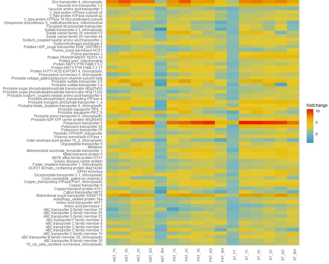
Want to transform your static R plots into dynamic, interactive visualizations? ggplot2 is renowned for creating beautiful static plots, but sometimes you need more. You need the ability to zoom, pan, and explore data points in detail—you need interaction. That’s where ggplotly shines. It bridges the gap between the popular ggplot2 package and the interactive plotting library plotly, adding a layer of dynamic exploration to your data visualizations. This comprehensive guide will walk you through everything ggplotly, from installation to advanced customization, empowering you to bring your data to life.
Getting Started with ggplotly
Before diving into the exciting world of interactive plotting, let’s set up our environment. ggplotly relies on both plotly (for its interactive capabilities) and ggplot2 (for creating the initial plots). Install these packages if you haven’t already:
R

install.packages("plotly")

install.packages("ggplot2")
Once installed, load them into your R session:
R

library(plotly)

library(ggplot2)
Now, you’re ready to start creating interactive wonders!
Transforming Static Plots with ggplotly()
The core function of ggplotly is, unsurprisingly, the ggplotly() function. This function acts as a translator, taking your static ggplot2 plots and converting them into interactive plotly graphs. Let’s illustrate with a simple example using the built-in mtcars dataset:
“`R
Create a basic scatterplot with ggplot2
my_plot <- ggplot(mtcars, aes(x = wt, y = mpg)) + geom_point()
Convert it to an interactive plot with ggplotly()
interactive_plot <- ggplotly(my_plot)
Display the interactive plot
interactive_plot
“`
With this single line of code, ggplotly(my_plot), your static scatterplot transforms into a dynamic visualization. Hover over the points to reveal tooltips, zoom in and out to explore different regions, and pan to shift the perspective. It’s a simple yet powerful way to enhance data exploration.
Enhancing Interactivity: Tooltips and Beyond
ggplotly offers more than just basic interactivity. Let’s explore some of the features that make it truly shine.
Customized Tooltips
Default tooltips are helpful, but custom tooltips provide more targeted information. You can specify which variables to display in the tooltip, making them more relevant to your analysis. For instance, let’s include hp (horsepower) and cyl (number of cylinders):
“`R
interactive_plot_enhanced <- ggplotly(my_plot, tooltip = c(“wt”, “mpg”, “hp”, “cyl”))
interactive_plot_enhanced
“`
Now, hovering over a point reveals not only weight and miles per gallon but also horsepower and the number of cylinders, providing a richer understanding of the data.
Dynamic Ticks and Rangesliders
ggplotly often handles dynamic ticks automatically, adjusting axis labels based on the zoom level—particularly useful for dense data. For time-series data, rangesliders allow users to select and focus on specific periods, providing interactive control over the viewed time window. Unlock the secrets to rapid strength gains with the power of daily undulating periodization.
Integrating with Dashboards
ggplotly seamlessly integrates with Dash, a framework for building interactive web dashboards. This integration enables embedding dynamic plots alongside other dashboard elements, creating powerful data-driven applications.
Customization and Advanced Techniques
Don’t like the default look? No problem! ggplotly allows extensive customization using the style() function. You can adjust colors, fonts, hover behavior, and much more. For advanced users, integrating custom JavaScript unlocks unique interactions and further customization. Explore the vibrant ggplotly community for inspiration and support. Dive into the fascinating world of glycophosphates and uncover their hidden potential.
Accessibility and Performance
While interactivity enhances engagement, accessibility is crucial. Ensure your plots are usable by everyone, regardless of disabilities. Performance can also be a consideration, especially with large datasets. ggplotly often handles this well, but optimization techniques might be necessary for extremely large or complex visualizations. Some experts believe that pre-rendering static images can improve initial load times.
Comparing ggplotly to Other Libraries
R offers other interactive plotting libraries like highcharter and leaflet. Each has its strengths. ggplotly excels in its tight integration with ggplot2. However, exploring alternatives like highcharter (built on Highcharts) or leaflet (for interactive maps) may be beneficial depending on specific project needs.
ggplotly: Frequently Asked Questions
What does ggplotly do?
ggplotly transforms static ggplot2 plots into interactive web visualizations using the plotly.js library. It seamlessly integrates with R Markdown and Shiny, making it ideal for dynamic reports and interactive dashboards. The style() and layout() functions from the underlying plotly package allow for customization.
Is Plotly better than ggplot2?
The “better” tool depends on your needs. Plotly excels in interactive plots, especially for dashboards and exploration. ggplot2 shines in creating polished, static visualizations for publications. ggplotly offers a compromise, but performance can be a factor with large datasets.
What is better than ggplot2?
For interactivity, Plotly and other libraries like highcharter, leaflet, and echarts4r offer alternatives to ggplot2’s static nature. Each library has its own strengths and weaknesses. The best choice depends on your specific requirements, including dataset size, desired level of interactivity, and performance considerations.
By understanding the power and flexibility of ggplotly, you can move beyond static visualizations and create engaging, interactive experiences that unlock deeper insights within your data. So, dive in, experiment, and unleash the full potential of your R visualizations!
- Crypto Quotes’ Red Flags: Avoid Costly Mistakes - June 30, 2025
- Unlock Inspirational Crypto Quotes: Future Predictions - June 30, 2025
- Famous Bitcoin Quotes: A Deep Dive into Crypto’s History - June 30, 2025


2 thoughts on “Unlock the Power of Interactive Visualization with ggplotly: A Comprehensive Guide”
Comments are closed.