Are abandoned online forms draining your website’s potential? A poorly designed form can be a major roadblock to conversions. This comprehensive guide provides actionable strategies to transform your web forms from frustrating obstacles into powerful lead generators.
Designing Forms that Convert: A User-Centric Approach
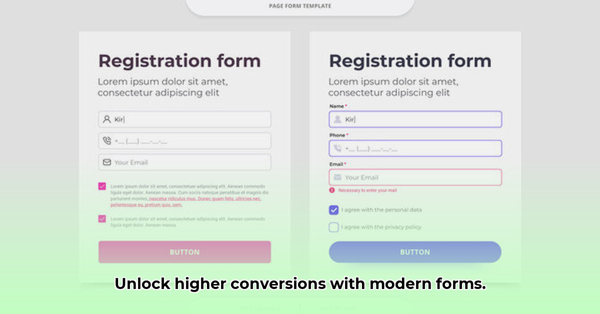
Effective form design seamlessly blends aesthetics and functionality, guiding users effortlessly towards conversion. It’s about creating an experience that encourages completion, not abandonment.
Single-Column Simplicity: The Clear Path to Conversion
Multi-column forms can overwhelm users, increasing the likelihood of abandonment. A single-column layout provides a clear, focused path, significantly improving user experience and completion rates. Eye-tracking studies demonstrate how single-column designs naturally guide users through the form, minimizing distractions and cognitive load.
Implementation Steps:
Structure for Clarity: Implement a single-column structure, ensuring a clear vertical flow for effortless readability.
Visual Harmony: Employ clear, legible fonts, appropriate spacing, and contrasting colors to enhance comprehension and reduce visual fatigue.
Consistent Alignment: Left-align form elements for improved readability and a clean, organized aesthetic. This consistency contributes to a smoother, more intuitive user experience.
A/B testing consistently reveals that single-column forms often outperform multi-column layouts, highlighting the significant impact of prioritizing user flow.
Brevity is Key: The Power of Concise Design
Lengthy forms deter users. Concise forms, laser-focused on essential information, minimize friction and encourage completion. This streamlined approach directly and positively impacts conversion rates.
Strategies for Concise Forms:
Essentialism: Request only absolutely necessary information. Each additional field increases the chance of abandonment. Conduct a thorough analysis to determine which fields are truly essential for your conversion goals.
Clarity in Language: Avoid jargon and complex terminology. Use clear, concise, and easily understandable language. Consider your target audience and their level of familiarity with your industry or product.
Chunking for Complex Forms: For unavoidable longer forms, break them into smaller, digestible sections with clear, descriptive headings. This makes the overall process feel less daunting and more manageable, encouraging users to progress through each step.
Industry research consistently demonstrates that concise forms lead to substantially higher completion rates. This underscores the value of a streamlined, user-friendly experience.
Strategic Field Placement: Guiding the User Journey
The order of form fields significantly impacts user flow. A logical sequence guides users smoothly through the process, increasing the likelihood of completion.
Best Practices:
Prioritize Key Information: Place the most crucial fields at the beginning to immediately capture user attention and establish context. This helps users understand the purpose of the form and encourages them to continue.
Logical Grouping: Group related fields together (e.g., name, address, contact information) to enhance user understanding and create a sense of organization. This logical flow minimizes cognitive load and makes the form easier to navigate.
Natural Progression: Structure fields in a natural order, such as personal information before payment details. This intuitive flow aligns with user expectations and creates a more comfortable experience.
Analyzing your target audience and their expectations is crucial for determining the most effective field order. Conduct user research to gain insights into their preferences and pain points.
Label Placement: Clarity for Seamless Input
While multiple placement options exist, clear association between labels and corresponding fields is paramount. A/B testing is invaluable for determining the optimal placement (above, left, or right) for your specific audience and form context. This data-driven approach ensures maximum usability and clarity.
Conducting A/B testing on label placement can provide data-driven insights into user preferences and help you optimize your form for better conversions.
A/B Testing: Data-Driven Optimization for Maximum Impact
A/B testing is crucial for form optimization. By comparing variations, you can identify the most effective layout, label placement, field order, and even microcopy for your target audience, leading to significant improvements in conversion rates.
The Importance of Data-Driven Decisions
A/B testing replaces guesswork with concrete data. By testing different variations, you identify design elements that resonate most with your users, leading to informed design decisions and measurable improvements.
How to Conduct Effective A/B Testing for Forms
Select a Platform: Choose a reputable A/B testing platform that integrates seamlessly with your website (e.g., Google Optimize, Optimizely).
Create Variations: Develop different versions of your form, systematically altering one element at a time (e.g., label placement, button color, microcopy).
Set Up the Test: Configure your chosen tool to distribute traffic evenly between variations, ensuring a statistically significant sample size.
Monitor and Analyze: Closely track key metrics like completion rates, bounce rates, time spent on the form, and error rates for each variation.
Interpret Results: Identify the winning variation based on your predefined success metrics and the statistical significance of the results.
Implement and Iterate: Implement the most effective design and continue testing to further refine your forms and achieve ongoing optimization.
Expert advice consistently emphasizes the importance of data-driven decisions in form optimization. Continuous A/B testing is key to long-term success and maximizing conversions.
Future-Proofing Your Forms: Adapting to Evolving User Expectations
To maintain effectiveness, web forms require ongoing optimization. Staying ahead of design trends and user behavior is crucial for long-term success.
User Experience First
Prioritize a seamless user experience by minimizing form fields, using clear and concise language, and ensuring mobile responsiveness. A positive user experience is essential for maximizing conversions.
Mobile Optimization: Essential in Today’s Landscape
In our mobile-first world, responsiveness is paramount. Ensure your forms are accessible and functional on all devices, providing a consistent and user-friendly experience regardless of screen size. Utilize mobile-specific input types like date pickers and sliders for enhanced usability.
Embrace Design Trends Strategically: Balance Aesthetics with Usability
Stay informed about emerging design trends, but prioritize usability over purely aesthetic choices. Implement trends thoughtfully, ensuring they enhance, not detract from, the user experience.
Continuous Improvement: The Key to Long-Term Success
Regularly monitor form performance, analyze user behavior data, and iterate based on your findings. Ongoing optimization is essential for staying ahead of the curve and maximizing conversions. Conduct user research to gain deeper insights into user needs and pain points.
Mastering Modern Form Design: Essential Expert Insights
Optimizing web forms is not a one-time task but a continuous process. Here’s a recap of key principles and insights from leading experts:
Core Principles for High-Converting Forms
Focus on a user-centric approach, concise design, single-column layouts (generally preferred), clear and concise labeling, inline validation for immediate feedback, mobile responsiveness, rigorous A/B testing, and accessibility for all users.
Designing for Conversions: A Step-by-Step Approach
Needs Analysis: Define your form’s purpose and identify the essential information required.
Layout Selection: Choose a single-column layout for optimal user flow.
Craft Clear Labels: Use concise, descriptive labels that clearly indicate the required input.
Implement Inline Validation: Provide immediate feedback to users as they complete each field.
Mobile Optimization: Ensure your form is fully responsive and functions flawlessly on all devices.
A/B Test Continuously: Test different variations to identify the most effective design elements.
Prioritize Accessibility: Design your form to be accessible to users with disabilities.
Data-Driven Refinement: Continuously analyze data and make adjustments based on user behavior.
Overcoming Common Form Challenges
Address common issues like low completion rates, high error rates, mobile abandonment, and lack of engagement through continuous optimization, user feedback, and data-driven design improvements. Regularly analyze user behavior to identify and address pain points.
Hello, My love for writing is rivaled only by my passion for in-depth research. While many may skim the surface, I dive deep, seeking the hidden gems of information that give a story texture and depth. Every word I write is backed by hours of exploration, ensuring that my work is not just compelling, but also meticulously accurate. Join me on a journey where every piece is a deep dive into the realms of knowledge and storytelling.