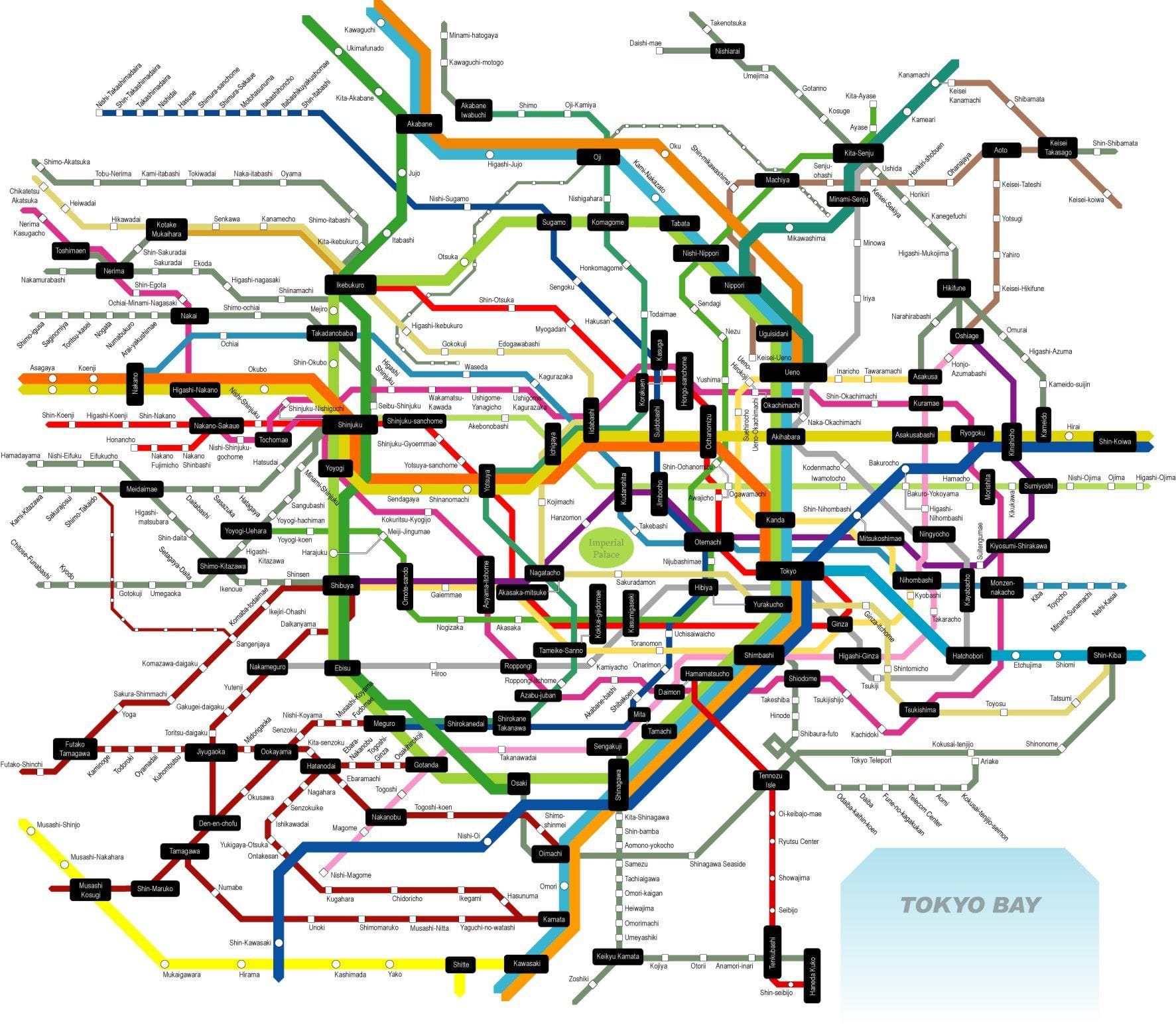
Subway map symbols are a universal language, guiding millions of passengers daily through complex underground networks. From simple dots to intricate icons, these symbols convey crucial information about station accessibility, transfers, and services. Understanding these symbols unlocks the full potential of a subway map, enabling efficient and stress-free navigation.
The Basics: Station Symbols
Ever glanced at a subway map and felt overwhelmed? Those seemingly random markings are a carefully crafted language, each symbol a concise guide through the underground labyrinth. Let’s decipher this visual shorthand and empower you to navigate the subway like a pro.
A dot is the most common symbol, marking a standard subway stop. Think of it as the visual shorthand for “train stops here.” But subway map designers use variations to provide even more information. A larger dot likely signals a major station – perhaps a transfer hub, a station with extensive amenities, or a connection to other transit. This visual hierarchy helps you quickly identify crucial points within the system.
Beyond the dot, you might encounter squares or diamonds. These often denote specific station types. A square might represent an express stop, while a diamond could indicate a local stop. Some systems use unique shapes to signify stations with step-free access or those near landmarks.
Beyond Location: Accessibility and Transfers
Subway map symbols convey more than just location; they also communicate accessibility and transfer options. A wheelchair symbol typically indicates an accessible station, probably equipped with ramps and elevators. You might also see symbols for elevators or escalators.
Furthermore, symbols for buses, trams, or trains suggest transfer possibilities to other transit modes at that station. Some maps even include symbols for airports, ferry terminals, or major landmarks.
The Map Key: Your Decoder Ring
So, you’re looking at a subway map and see a scattering of symbols. How do you know what they mean? That’s where the map key, or legend, comes in. This essential tool deciphers the symbols, explaining what each represents.
The key is crucial for understanding the various lines, typically represented by different colors or line styles. It also explains symbols for transfer points, often depicted as intersecting circles or unique icons. These symbols are crucial for planning efficient routes, especially when transferring between lines.
Modern subway maps often include symbols for accessibility features in the key, such as wheelchair ramps and elevators. Some even mark points of interest, effectively turning the map into a mini-guide to the city.
| Symbol | Meaning |
|---|---|
| ● | Subway Station |
| ◉ | Transfer Station |
| ♿ | Wheelchair Accessible Station |
| █ | Red Line |
| ▬ | Blue Line |
Remember that while many symbols are relatively standard, variations exist between systems. Always consult the map key to avoid confusion.
The Evolution of Subway Map Symbols
Subway map symbols have evolved significantly. Early maps were often simpler, using basic dots for stations. As systems grew, symbols became more informative, adapting to new technologies and passenger needs. The digital age has brought interactive maps and apps, often incorporating dynamic symbols to indicate service disruptions or train locations.
Research continues to explore ways to improve clarity and effectiveness. Some studies suggest using color-coding to indicate service types, while others investigate better representation of complex transfers. As technology progresses, we can anticipate even more sophisticated and user-friendly symbols.
Exploring Deeper: Design and Accessibility
While seemingly simple, the design and standardization of subway map symbols involve complex considerations. Clarity, simplicity, and accessibility for users with visual impairments are paramount. Ongoing research explores the psychology of symbol recognition and the impact of design choices on user understanding. The subarctic evergreen forest offers an interesting parallel in terms of adaptation to challenging environments, although in a completely different context.
One area of ongoing study is the design of accessible symbols. Experts are constantly working to improve symbols for users with visual impairments, using color contrast and clear shapes. User experience research, including surveys and interviews, gathers feedback on symbol effectiveness. Case studies of different subway systems offer valuable insights into successful approaches and areas for improvement.
The future of subway map design may involve augmented reality or other emerging technologies, transforming how we interact with maps and their symbols. These advancements could provide personalized route suggestions or real-time information integrated directly into the map’s symbols.


