Get ready to dive into the thrilling world of typography as we unravel the incredible story of the Baskerville typeface. From its humble beginnings in the workshops of John Baskerville to its enduring presence in the world of design, embark on an enlightening journey through its history. Discover the fascinating features that set Baskerville apart and meet the intriguing characters who have played a role in its enduring success. By the end of this exploration, you’ll understand the timeless appeal and significance of the Baskerville typeface, recognizing its captivating impact on the world of print and design.
Let’s travel back to 1754. Picture a world where books were still a luxury, meticulously crafted by hand. This is where John Baskerville, an ambitious printer with an eye for beauty, steps onto the scene. He wasn’t content with the way existing typefaces looked – they felt a bit rough around the edges. So, he decided to create his own, and thus, the Baskerville typeface was born.
What made Baskerville’s creation special? Imagine letters with crisp, clean lines, almost as if they were chiseled from marble. The contrast between the thick and thin strokes was more dramatic, giving the text a sense of elegance and clarity that was simply breathtaking for its time.
Baskerville didn’t stop at just making pretty letters. He was obsessed with every detail of his books, from the paper and ink to the overall design. This meticulous approach, combined with his groundbreaking typeface, revolutionized the way books looked and felt.
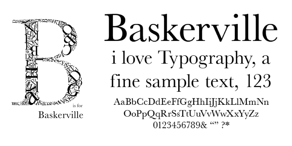
Now, let’s zoom in on some of the unique features that make Baskerville so recognizable:
The Letter ‘E’: Notice how the bottom arm elegantly extends outwards.
The Letter ‘W’: It stands out from the crowd without a serif in the center.
The Lowercase ‘g’: Its distinctive loop is a Baskerville hallmark.
These subtle yet powerful characteristics set Baskerville apart from its predecessors, marking a significant shift in typeface design.
Fast forward to the digital age, and guess what? Baskerville is still as popular as ever! Designers recognized its timeless appeal and created digital versions, ensuring this elegant typeface continued to grace our screens.
Baskerville’s impact extends far beyond just aesthetics. This typeface has graced the pages of countless influential publications, shaping the way information is presented and perceived. Even today, its influence can be felt in the world of design, a true testament to its enduring legacy. So, the next time you pick up a book or read an article online, take a closer look at the typeface. You might just be experiencing the legacy of John Baskerville, a man who dared to challenge conventions and, in doing so, left an indelible mark on the world of typography.
What is Baskerville based on?
John Baskerville, the man behind the Baskerville typeface, was a bit of a rockstar in the 18th-century printing world. But what exactly inspired his iconic creation? It wasn’t just one thing; it was a whole blend of influences and innovations.
Baskerville is considered a “transitional” typeface, bridging the gap between the old-school, heavier typefaces and the more modern, sleek styles that were starting to emerge. One of his biggest inspirations was likely the work of William Caslon, another legendary type designer. Caslon’s typefaces were known for their clarity and elegance, and you can definitely see some of that DNA in Baskerville’s work.
But Baskerville wasn’t just copying what came before. He was a true innovator, constantly experimenting with new printing techniques and even dabbling in papermaking. He wanted to create a typeface that was not only beautiful but also super readable, and he believed that the quality of the paper and printing played a huge role in that.
Baskerville’s typeface, with its sharp serifs, high contrast, and spacious proportions, wasn’t just designed; it was meticulously crafted, a true reflection of its creator’s passion and relentless pursuit of typographic perfection.
However, there’s still a lot we don’t know about Baskerville’s creative process. Some experts believe he might have drawn inspiration from other sources, like calligraphy or even architectural lettering. Ongoing research and the discovery of new historical documents could shed more light on the specific details of his influences. It’s a fascinating area of study for anyone interested in the history of typography!
What is the connotation of the Baskerville typeface?
We’ve talked about what makes Baskerville unique, but what kind of feeling does it give off? You know, that vibe or impression a font gives you even before you read the words. Baskerville just has that air of “take me seriously” about it, often associated with:
Elegance and sophistication: Imagine seeing Baskerville on a fancy invitation. Its clean lines and strong contrast make it look super sharp and clear.
Professionalism: This is probably why it’s a favorite for things that need to look professional, like academic papers or official documents.
Tradition and Authority: Baskerville has been around for centuries and still looks amazing. Its classic design gives a feeling of tradition and authority, like it’s been passed down through generations of careful printers.
Of course, there’s always more to explore! Some typographers might have different takes on Baskerville’s personality. Plus, our understanding of fonts is always evolving alongside how we use them.
What are some interesting facts about John Baskerville?
John Baskerville wasn’t just a printer; he was a businessman who really wanted to make books look amazing. He wasn’t happy with how things were being done, so he took matters into his own hands!
A Printing Revolutionary: Baskerville was all about refining those old-school typefaces to create something truly eye-catching. He was super passionate about high-quality printing, to the point that he even invented his own type of paper and a super black ink!
Ahead of His Time: Of course, not everyone was immediately on board with Baskerville’s innovations. Some folks initially criticized his style, but his typeface eventually won everyone over.
It’s pretty amazing to think that his design is still used today in books, magazines, and even on our computers and phones. It makes you wonder, what would Baskerville have thought of all the digital fonts we have today? It’s a question we can’t answer for sure, but it’s clear that his passion for beautiful and readable typefaces has left a lasting impact on the world of design.
Is Baskerville a Professional Font?
Baskerville walks that fine line between being stylish and being serious. It’s like that perfectly tailored suit – you know, the one that makes you look put-together without being stuffy.
Think about it: Baskerville has been the go-to font for some really big names – universities, publishers, even historical documents. That says a lot about its staying power and the air of authority it lends to any text.
You can picture it on a business card, a website, or even the cover of a report. It just has that “I mean business” vibe, but in a way that’s still approachable and easy to read.
Of course, “professional” can mean different things to different people. There’s no one-size-fits-all answer. But if you’re looking for a font that’s classic, versatile, and makes a good first impression, Baskerville is definitely worth considering.
What is special about Baskerville?
Imagine a typeface that’s both easy on the eyes and drop-dead gorgeous. That’s Baskerville in a nutshell.
Visually Appealing: One of the things that makes Baskerville so visually appealing is the stark contrast between its thick and thin strokes. Those crisp, defined serifs combined with the open curves and generous spacing just make it a joy to look at.
Easy to Read: It’s like each letter has room to breathe on the page, which makes it incredibly easy to read.
Timeless and Versatile: Baskerville has been around for centuries and it’s still a go-to for designers today. It just works, whether you’re going for a classic, vintage vibe or a sleek, contemporary look.
Digital Adaptability: Baskerville translates beautifully to the digital world, which is probably why you’ll find it used by everyone from Apple to WordPress.
Baskerville: readable, versatile, and timelessly elegant. What more could you want in a typeface?
What is the history of the name Baskerville?
The name Baskerville in the world of typography is synonymous with John Baskerville, a mover and shaker in the 18th-century English printing world. He wasn’t just some random printer though; this guy was passionate about making things look good.
A Typographic Studio: John had this printing business in Birmingham where he started experimenting with different ways to design typefaces. His big goal? To make letters easier on the eyes and way more visually appealing than anything else out there.
Refinement, Not Copying: John drew inspiration from earlier typefaces, especially the work of William Caslon, but he wasn’t content with simply copying. He was all about refining those letterforms, making the serifs extra sharp and really playing up the difference between those thick and thin strokes.
A Meticulous Approach: John was meticulous, bordering on obsessive, about spacing and proportions. He knew these elements were key to creating a harmonious and easy-to-read typeface.
A Breath of Fresh Air: Baskerville’s typeface was a total game-changer that became a massive hit almost instantly.
Today, the name Baskerville is like a gold standard in typography. It represents excellence, and the typeface itself is considered one of the most influential designs ever. It’s a testament to John Baskerville’s pioneering spirit and his dedication to pushing the boundaries of typography. He was a true innovator, and his work continues to inspire designers even today.
Was The Hound of the Baskervilles a real thing?
Sir Arthur Conan Doyle, the author of The Hound of the Baskervilles, definitely knew how to spin a yarn, and he wasn’t above borrowing inspiration from real life.
Dartmoor’s Spooky Reputation: Dartmoor itself, the setting for the novel, has its fair share of spooky stories. People have been whispering about a ghostly dog roaming the moors for ages, long before Sherlock Holmes came on the scene.
Blending Reality and Fiction: It’s like Doyle took these local legends, sprinkled in some fictional drama, and boom—the Hound of the Baskervilles was born.
A Symbol of Deeper Fears: The Hound becomes a symbol for all sorts of things – the fear of the unknown, the weight of family secrets, the darkness that can lurk beneath even the most seemingly ordinary places. It’s these deeper themes, explored through the lens of a good old-fashioned mystery, that make The Hound of the Baskervilles such an enduring tale.
So, while we may never know for sure if there was a real hound, one thing’s for certain: Doyle tapped into something primal and unsettling with this story, something that continues to fascinate and frighten readers to this day.
Who was William of Baskerville based on?
Let’s switch gears a bit and talk about a character who shares the Baskerville name: William of Baskerville, the sharp detective from Umberto Eco’s novel The Name of the Rose. Did Eco name his insightful protagonist after the famous typeface for a reason?
Intriguing Parallels: While not totally clear-cut, there are some intriguing parallels. William of Baskerville is known for his logic, his meticulous attention to detail, and his ability to see things that others miss—kind of like how the Baskerville typeface was revolutionary for its clarity and elegant design.
Emphasis on Books and Writing: The novel is set in a medieval monastery known for its impressive library and scriptorium. This setting emphasizes the importance of books, writing, and by extension, typefaces, during that time.
Possible Inspiration from William of Ockham: Some scholars even suggest that William’s character might be loosely inspired by William of Ockham, a 14th-century English philosopher known for his principle of parsimony, often called “Ockham’s Razor.”
Eco’s Intentions Remain Unclear: However, it’s important to remember that Eco never explicitly confirmed a direct link between his fictional detective and the typeface or any specific historical figure.
That being said, the potential connections are pretty fascinating to consider. It really makes you appreciate the layers of meaning and symbolism that Eco wove into The Name of the Rose.
What Was the Inspiration for Baskerville Hall?
The grand Baskerville Hall in The Hound of the Baskervilles likely draws inspiration from a number of sources.
Grand Estates of the Time: Some folks believe that Baskerville, being the creative soul he was, probably drew inspiration from the grand houses of his time. Think about those fancy estates you see in period dramas – places like Chatsworth House or Blenheim Palace.
Reflecting Baskerville’s Style: Baskerville was ambitious, driven, and he wanted the world to know about his work. He wasn’t just going to slap together any old shack and call it a day. He wanted his home to reflect his impeccable taste and attention to detail.
Local Architectural Traditions: The Midlands region of England, where Baskerville Hall stands, had its own architectural traditions. We’re talking about those stately brick houses that were all the rage in the 18th century.
We might never know for sure exactly what went through Sir Arthur Conan Doyle’s mind when he dreamed up Baskerville Hall. But one thing’s for certain: it was a combination of influences, aspirations, and a desire to create something truly special.
What animal was The Hound of the Baskervilles?
The book doesn’t really come right out and say “Hey, the Hound is this kind of animal.” It keeps things pretty vague, which actually adds to the mystery.
Vague Descriptions: We get glimpses of a huge, monstrous dog with glowing eyes, but is that really what it is? Or is that just how fear twists things up in the dark?
Supernatural Element: If the Hound is real, how could it possibly be a normal animal? It’s supposed to be connected to this old family curse, which makes it seem a whole lot more supernatural.
Theories Abound: Some folks think it might be a type of demonic entity that’s taken on a dog-like form, while others believe it could be the spirit of a real dog, twisted and made monstrous by the curse.
A Symbol of Family Sins: Then there’s the whole question of the Baskerville family history. The book hints that there’s something dark and messed up in their past, something that might have even summoned this creature in the first place. It’s almost like the Hound is a symbol of the family’s sins coming back to haunt them.
So, what do you think? Is the Hound of the Baskervilles a real, flesh-and-blood creature, or is it something far more sinister? There’s no easy answer, and that’s what makes this book so darn good!
Don’t miss out on the intriguing story of how Bellingrath Gardens came to be!
Hello, My love for writing is rivaled only by my passion for in-depth research. While many may skim the surface, I dive deep, seeking the hidden gems of information that give a story texture and depth. Every word I write is backed by hours of exploration, ensuring that my work is not just compelling, but also meticulously accurate. Join me on a journey where every piece is a deep dive into the realms of knowledge and storytelling.


1 thought on “Exploring the Enduring History of the Baskerville Typeface”
Comments are closed.